The human face of data


“Once we find issues of inequality in data, it’s also our responsibility to spend time to understand the causes of those inequalities.” - Amanda Makulec
Recently we asked Amanda Makulec, Rabah Kamal, Francis X. Campion, members of the Tableau Advisory Board, what they felt were the biggest data lessons they’ve learned since the beginning of the pandemic. The learnings were both practical and provocative; from the necessity for trust, to the power of multi-disciplinary collaboration, to addressing the limitations of data that lead to misinformation and inequality. The human face of data is part one of a three-part series: Data in the time of COVID-19: What have we learned?
____________________
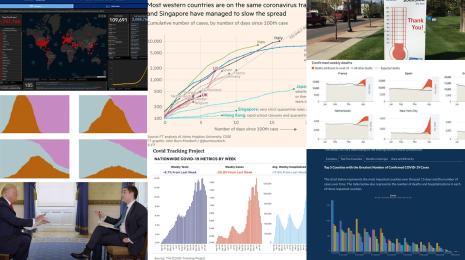
“I’ve never seen so many people so fixated on a cluster of charts,” notes Amanda Makulec. “At no point in recent memory has the sheer quantity of available data and data visualizations on a single topic evolved so quickly. And as the pandemic dominated every aspect of our lives in 2020, there seemed to be a corresponding chart to go with it. The sheer proliferation of data visualizations has surfaced critical areas of concern for data scientists, and the public at large.”
This fixation on these evolving charts forced data visualization developers and readers to address the human side of health data and the complexities and uncertainty in monitoring an emerging pandemic. More from Amanda:
Data points often represent people, and we need to be respectful of that when designing and communicating information. Perhaps this is more of a lesson for data viz practitioners than consumers, but COVID-19 charts were a stark reminder to think about the good we can do through data viz and the unintended consequences of what we publish, particularly when our charts are informing individual and policy level decisions.
Data being used to inform broad public decisions, like adopting public health prevention measures, needs to be treated with even greater care than many other public datasets. Misrepresenting information can minimize someone’s understanding of risk, and influence their decision making around adopting prevention behaviors. We continue to see this today in discussions around vaccine hesitancy. By widely sharing numbers about vaccine hesitancy, are we creating more of a problem in encouraging uptake of the vaccine, particularly when we have so many supply side issues to deal with?
Data art can communicate the immense scale of a tragedy in ways that big numbers on a screen cannot. Some of the most powerful and emotive data displays visualizing the scale of loss to COVID-19 were not experienced on a screen, but in a field or the eves of a church, where data artists installed flags, chairs, origami cranes, and other symbols of the lives lost to COVID. Data journalists found a wide range of ways to commemorate the milestone of 500,000 documented COVID-19 related deaths in the US, and while many of the digital and print graphics were impactful, nothing has come close to walking through a field of flags for me.
Summary statistics mask inequalities. Early on, US case data was represented at national, state, and eventually county levels, but it took months and tireless advocacy to get states to report COVID-19 statistics disaggregated by race. These numbers pointed to the disproportionate impact of the pandemic on Indigenous, Black, and Hispanic/Latinx communities in the US. This was not an issue of biology, but one connected to these groups making up the majority of essential workers who did not have the privilege of working from home and isolating throughout the year and issues of systemic racism and persistent inequities. Once we find issues of inequality in data, it’s also our responsibility to spend time to understand the causes of those inequalities.
Data collection is complex. We should ALWAYS spend the time to understand how data is collected before we dive into visualization information. This is a particularly pointed lesson when you’re watching daily or real-time figures, which may change (for valid reasons) or have peaks and valleys due to reporting noise or corrections. Over time, data journalists expanded the ways these anomalies were annotated on charts, embedding data quality notes into the charts and not just the footnotes—this is a practice we should expand in our field.
Don’t rely on any single measure to tell the full story. Over a year, reports evolved from stories about cases and deaths to test positivity, hospitalizations, and other measures. A pivot mid-way through 2020, towards using year-over-year comparisons of mortality (calculating an ‘excess mortality’ statistic) gave us a more complete picture of the staggering scale of the impact of COVID-19, particularly when assessing what happened in the early months of the pandemic when testing was limited.
Rapid development of charts happens at the expense of accessibility. Red-green color palettes are one concern around the early charts plotting the expansion of COVID-19, but issues persisted around how accessible visualizations about the pandemic were to those who use screen readers or other assistive devices. We must work harder to prioritize accessibility and make information more available to all. As Doug Schepers has written, data visualization in itself is an accessibility tool—it makes patterns in massive tables of numbers quickly accessible to many of us. Let’s go to the next step and ensure the accessibility of our charts and graphs of this critical public health information.
Open data initiatives and data transparency matter. In the US, as we grappled with the challenges of mounting case counts, issues of racial justice, and a contentious election (all stories told through data), we also had an administration actively suppressing information from the public. This creates mistrust, and was one of many signals of a failed response to the pandemic that resulted in the current reality that the US accounts for more than a quarter of the global cases to date. To make data more accessible in the long term though, we must address the technical debt many countries have around health informatics - especially in the United States.
___________________
This is part one of a three-part series. Find the other blogs in the series here, and visit the Tableau COVID-19 Data Hub for more data insights, resources, and thought leadership to help you navigate the pandemic.
Related Stories
After a year of COVID-19 charts, eight data communication lessons learned
 April 19, 2021

4 reasons why embedded analytics is your path to a new revenue stream in the COVID-19 era
This blog post covers four reasons why organizations should consider embedded analytics.

What we can learn from the public sector’s response to COVID-19
 May 21, 2020
A broad consensus is that COVID-19 will drive digital transformation in the public sector. During the 2020 Government Summit, speakers from Veteran Health Administration, Southwest Texas Regional Advisory Council, and FEMA discuss new processes, new technologies and innovations, and most importantly, a new mindset on decision making in the midst of crisis.
Subscribe to our blog
Get the latest Tableau updates in your inbox.