Pride Viz Gallery: Alexander Vassilev


Pride Month is a celebration of the impact that the LGBTQ+ community has had on making this world a better place. We are thrilled to be launching a new Pride exhibition in the Tableau Public Viz Gallery during the month of June - we hope you’ll take the time to explore the gallery and walk away feeling like you learned something new.
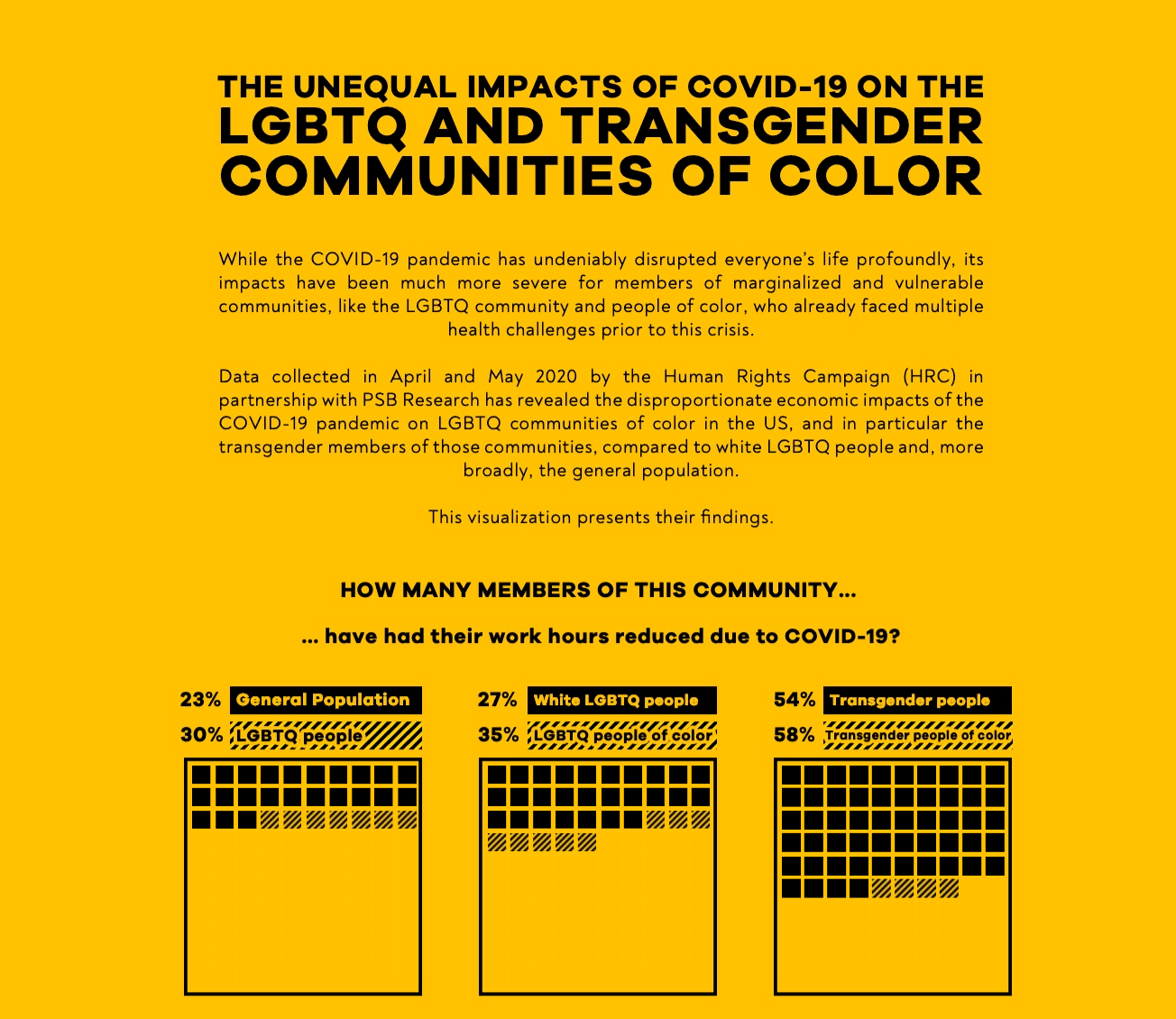
This week we sat down with Alexander Vassilev, one of the authors featured in this year’s pride exhibition, to talk about his viz ‘The Unequal Impacts of COVID-19 on the LGBTQ and Transgender Communities of Color’ and his experiences with the Tableau Community.
Before we get started, tell us about yourself and your involvement with the Tableau Community.
My name is Alex, and since I graduated from university two years ago, I have worked for one of the Big Four English banks, first as an analyst and more recently as a data scientist.
My introduction to Tableau came when my first team tasked me with visualizing the vast amount of data that they managed. Ultimately, they hoped to better understand their data in order to make more impactful business decisions and reduce the amount of time spent producing various reports. Whilst I was nervous at first as I had never worked with Tableau before, I was also excited to learn how to use Tableau in order to help my team.
Whilst I was looking for resources to learn Tableau, I stumbled across Makeover Monday on Twitter. Very quickly, I started to create weekly data visualizations. As I did that, I began to feel more confident using Tableau and telling a story with my data. I was really proud when I was featured twice as a Tableau Public Viz of the Day. The feedback and positive encouragement from members of the Tableau Community and Zen Masters have helped me enormously in my data visualization journey.
We recently launched a Pride exhibit in the Tableau Public Viz Gallery and your viz 'The Unequal Impacts of COVID-19 on the LGBTQ and Transgender Communities of Color’ was featured. Can you tell us a bit about what inspired you to create this visualization?
I created this data visualization last year in the midst of Pride Month, the Black Lives Matter protests, and the COVID pandemic. When I discovered the data from the Human Rights Campaign, I found that I could tell a very interesting and thought-provoking story with it. I did not come across any other visualizations that attempted to reveal how the COVID pandemic affected the LGBTQ and transgender community.
What were you hoping to accomplish with this visualization?
I hope that the visualization brings awareness of the challenges that LGBTQ and transgender people of color experienced during the pandemic, like it did for me. I created it with the aim to motivate people to begin learning more about the experiences of LGBTQ and transgender people of color and how they can help tackle the inequalities.
While you were creating this visualization, what were some of the findings that struck you the most?
I think what is striking about my data visualization is that it highlights how LGBTQ and transgender people of color are more severely impacted by the pandemic than the broader LGBTQ community and the general population. Whilst I was aware of those inequalities prior to creating this data visualization, I did not realize the extent.
What do you hope that people take away from interacting with this visualization?
I hope that people will be more vocal and involved in the conversations around the issues that the visualization presents.
This visualization is super powerful, what has the response from the community been?
I received positive feedback from LGBTQ colleagues and friends, with whom I shared the visualization. They felt that I used the data effectively to explain the persistent challenges of their community, especially during the pandemic. This data visualization is another way to show support to the community.
When we were building out the Pride viz gallery we found that there weren’t as many visualizations compared to other topics so I would love to learn more about how you found this data source and any tips for others.
I like reading a lot, so when I come across a topic that I know very little about, I become intrigued to find out more. Last year when all of the events happened, I read an online article that referenced the Human Rights Campaign data, and decided to visualize it to share it with a wider audience. So, be curious about the data that you see, and try to imagine the stories that you could tell with them.
What are some of your favorite data visualization resources?
Tableau Public, Behance, The Pudding, and the Twitter accounts of New York Times Graphics and Post Graphics are great places to look for inspiration.
Related Stories
Meet Iron Viz 2024 Finalist Jessica Moon
 April 15, 2024
Meet Iron Viz 2024 Finalist Pata Gogová
April 8, 2024
Student to BI Analyst, How Tableau Can Lead to a Successful Data Career
 March 20, 2024
Subscribe to our blog
Get the latest Tableau updates in your inbox.