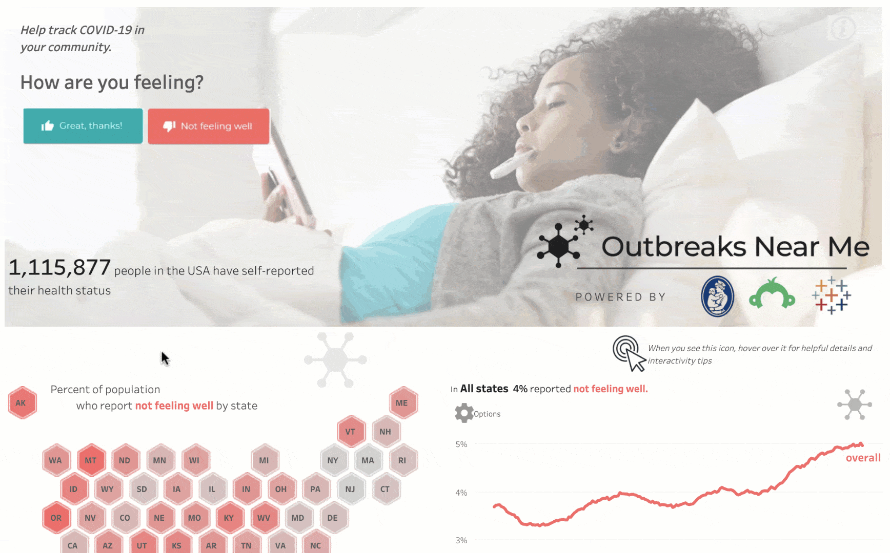
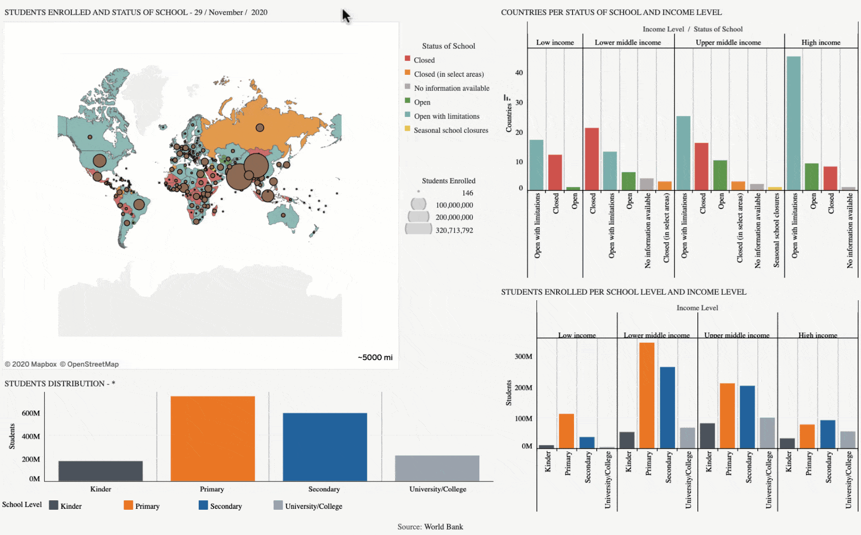
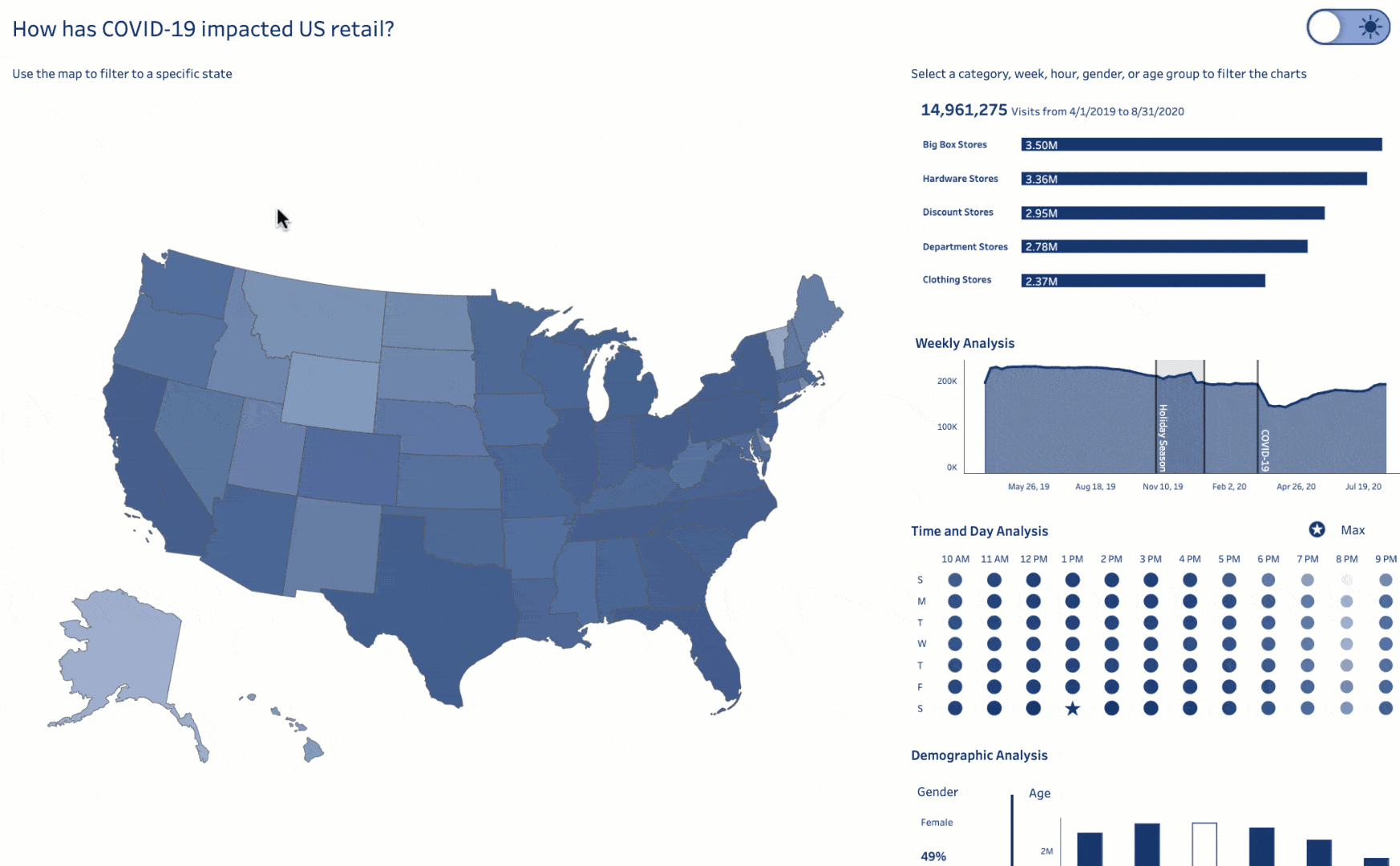
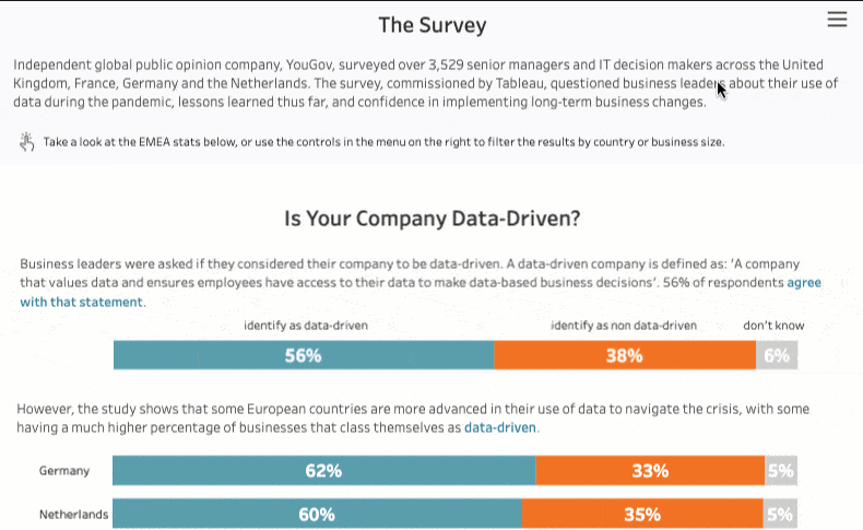
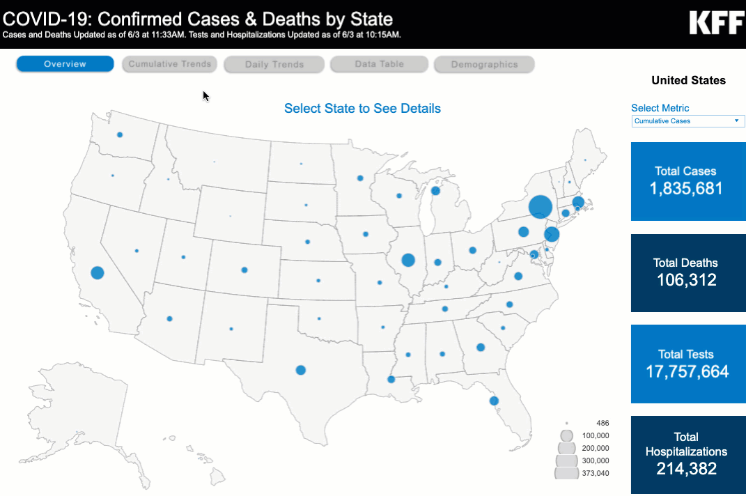
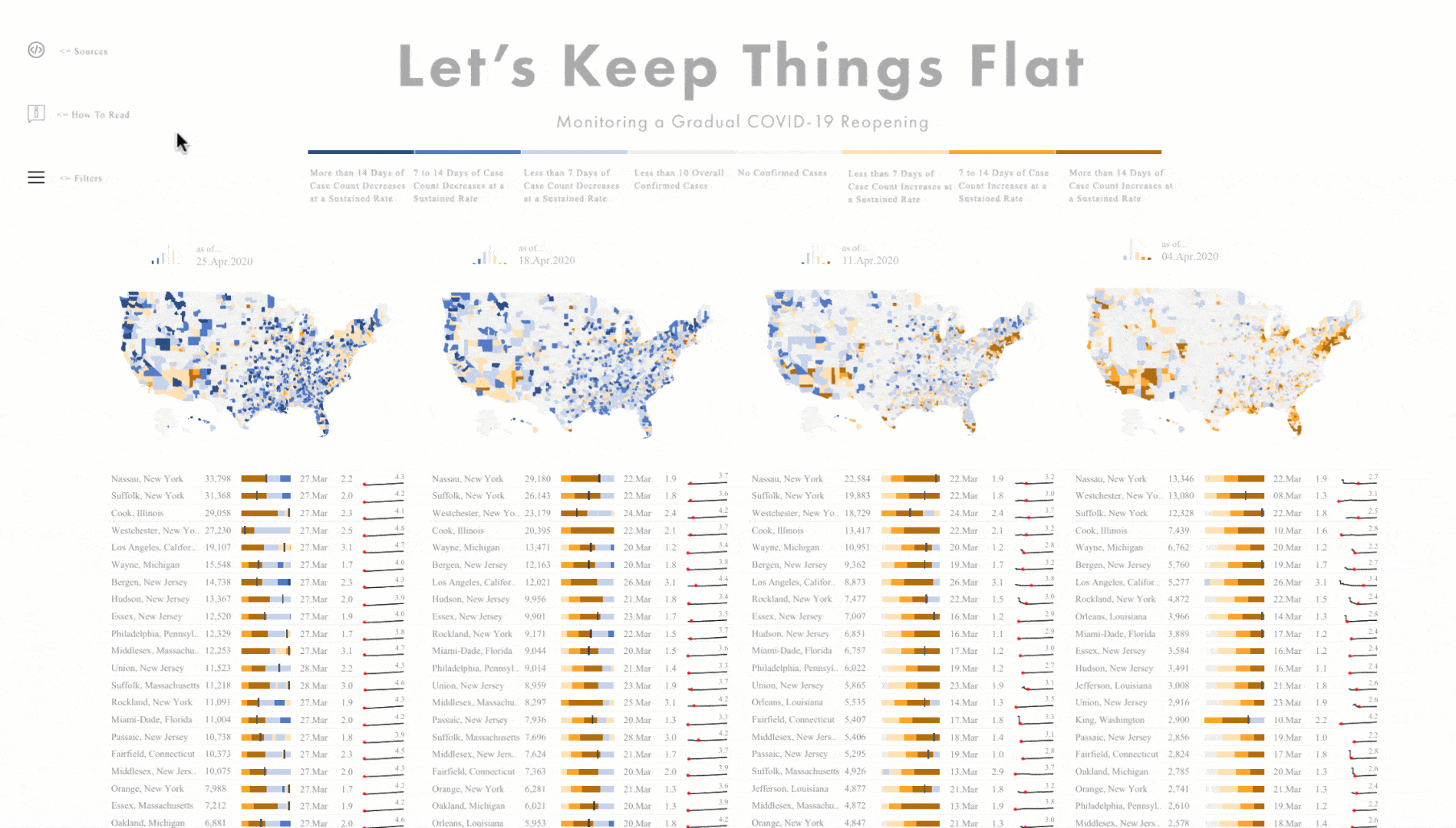
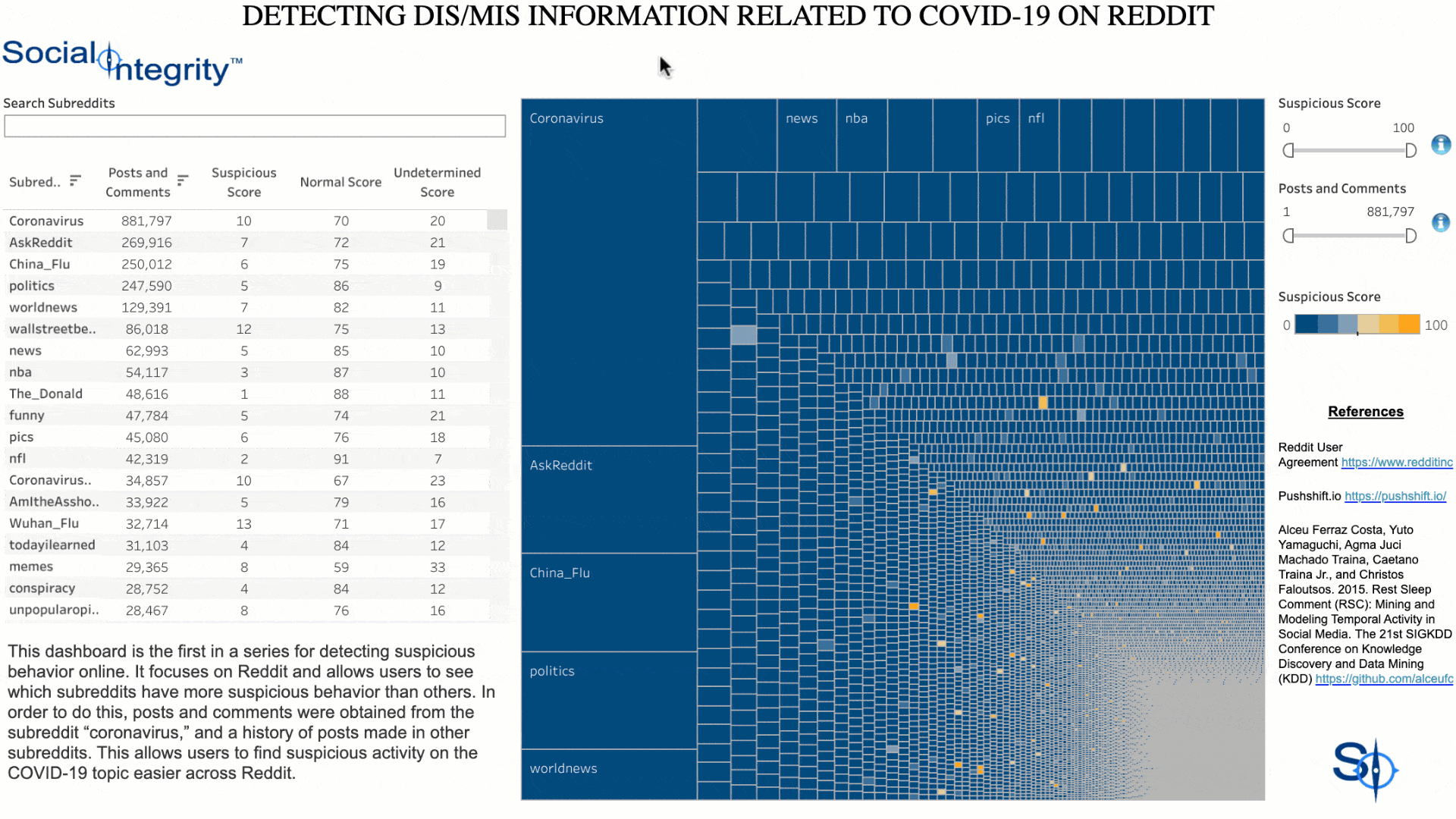
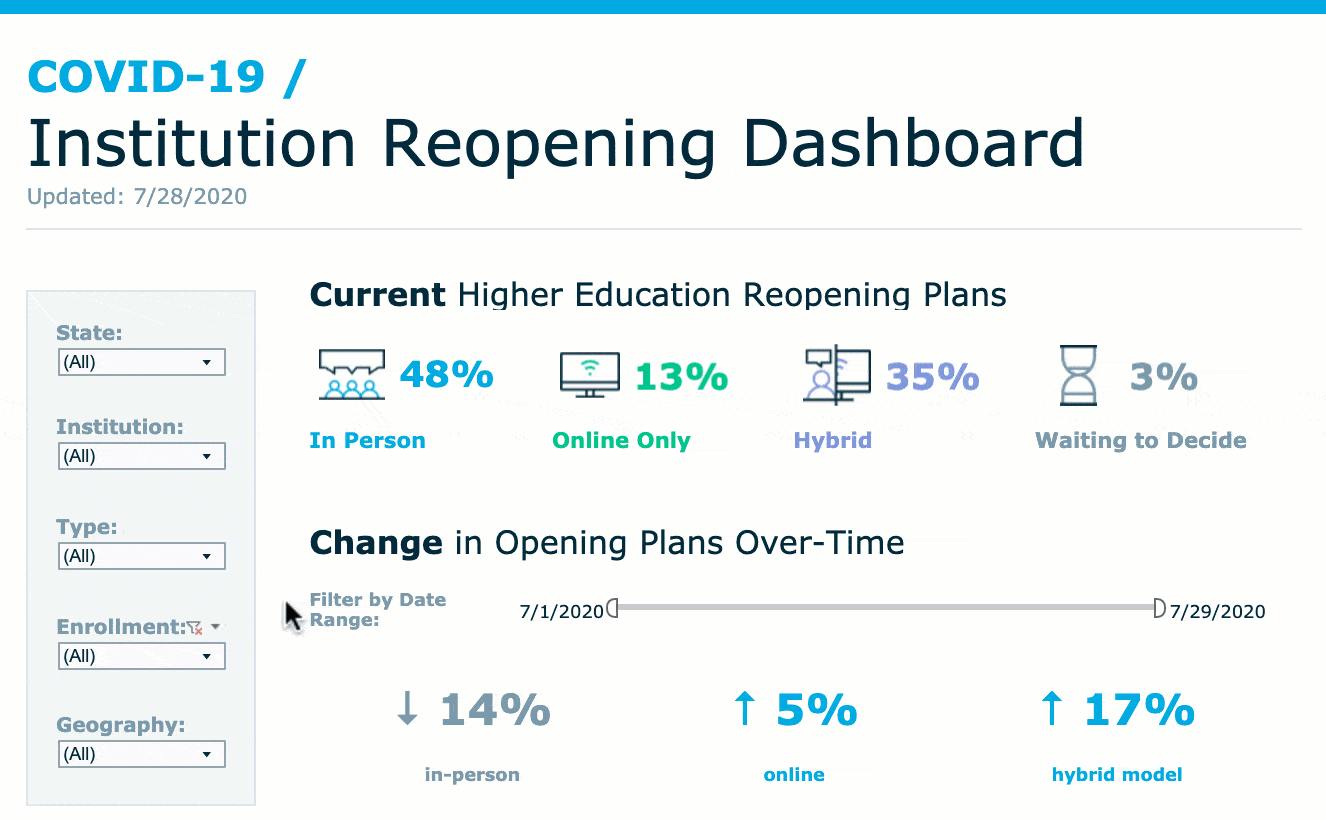
COVID-19 Data Stories

Real-world solutions from people using data to navigate the pandemic

Americans split over mask wearing in the workplace

As workplaces across the US welcome back employees and customers, it appears people are still divided on if and how long they’ll be wearing face masks. The data comes from Tableau and Momentive (formerly SurveyMonkey) through Pathway to a New Normal, a year-long public opinion research initiative that will explore through data how people are thinking about work in a changed America.

LEARN MORE

Japan builds nationwide vaccine dashboard

Japanese citizens can see nationwide COVID-19 vaccination data, thanks to a government-sponsored dashboard created with Tableau. The Vaccination Status Dashboard uses open data sources that provide status by prefecture and gender, and also allows users to see vaccination rates within the vulnerable elderly population.

See the Viz

PATH partnerships in Africa enable data-driven disease tracking, improving population health

PATH, a longtime Tableau Foundation partner and global health nonprofit, has collaborated with several African nations to help expand pre-existing health tracking dashboards, enabling simultaneous monitoring of disease data, including COVID-19 and malaria. With a visualization of multiple diseases, health officials are able to quickly understand impacts, where to allocate resources, and how to meet objectives for disease control and elimination.

Learn more

Poll: COVID-19 vaccination for children

Now that nearly half of the US adult population has received at least one dose of COVID-19 vaccine, the next question on everyone’s mind is: what about children? The Pfizer vaccine has been approved for use in children ages 12-15, and clinical trials are underway to test its efficacy and safety for younger kids. But whether children get vaccinated or not is dependent on their parents. This dashboard featuring SurveyMonkey and Outbreaks Near Me data captures how parents’ opinions about vaccination are changing.

Learn more

Vaccine equity in Georgia

This dashboard created by the Southern Economic Advancement Project to advance equitable access to vaccines in Georgia shows a real-time view of all available vaccination sites in the state, along with a look at community-level indicators that may pose barriers to access. With this dashboard, SEAP aims to support an equitable recovery from COVID-19 that ensures the state's most vulnerable residents are prioritized and supported.

Learn More

UNICEF uses data to help children impacted by COVID-19

Children in the poorest countries, already in desperate situations, are at higher risk of even greater suffering because of the pandemic. To help all children impacted by COVID-19, we need to know more - and using data insights, UNICEF is working to find solutions.

Watch the Full Video

India: Volunteers create dashboard to help citizens find critical resources

India is in the grips of a dire surge of COVID-19 infections, now accounting for 46% of global cases. Medical supplies and hospital beds are in high demand, along with services including food delivery and mental health support. A group of volunteers in India have addressed this critical need for information with a dashboard to help people locate the resources and care they need. To date, there are data for 25 cities, with more cities to be added as data is compiled.

Explore the Viz

What we can learn from open data

In the Netherlands, Deloitte is leveraging the power of open data as part of a State of the State initiative that features a dashboard visualizing trends related to COVID-19 and the new normal. With a multi-dimensional view into the impacts of COVID-19, it’s possible for policymakers and organizations to see and understand the broader story, and lead with data-driven decisions.

Read the Blog

COVID-19 and race

Broad, summarized data doesn't tell the story of the unique impacts and challenges faced by communities of color, especially Black/African-American and LatinX. To begin to understand how COVID-19 has impacted racial groups in the US—and to develop solutions—it’s necessary to look beyond the topline numbers and analyze disaggregated, localized data. Read more, and explore these powerful visualizations to gain additional perspective on why data like this is so critical to our understanding of the inequities of COVID-19.

Read the Blog

Mental health crisis requires data-driven insights

Mental health can no longer be considered independent from physical health. We need to tell that story with data, and create solutions using data-driven insights. Watch the video, and follow the link to read a blog about mental health and substance abuse from Kaiser Family Foundation.

Read the Blog

Understanding COVID-19 Vaccine Experiences & Perceptions

With the global rollout of COVID-19 vaccines, people with serious medical conditions have faced unique challenges in understanding how vaccination fits within their health journey. Inspire, an online community of more than two million patients and caregivers representing 3,300 health conditions, surveyed its users in order to learn about peoples’ perceptions and experiences with the vaccine. This interactive, filterable dashboard visualizes the results of this survey.

Interact with the Viz

Read the Q&A Blog Post

COVID-19 and retail analytics

The COVID-19 pandemic has changed the way retailers do business. All retailers have had to learn new ways to service their customers, virtually, and at the same time, proactively anticipate behaviors and trends in order to meet the fast-changing needs of those customers. None of this is possible without data. The transition to a world that requires near real-time insights has been swift, and retailers who have prioritized a data-centric approach to their business are seeing the power of analytics in everything from inventory management to supply chain optimization.

Read the Whitepaper

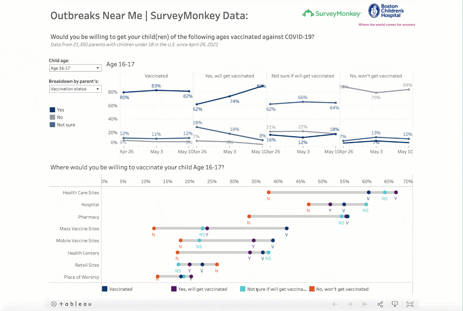
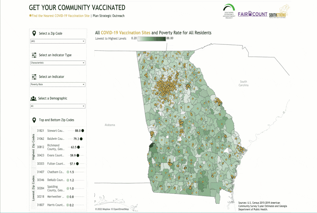
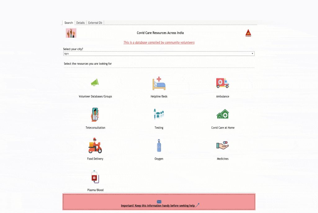
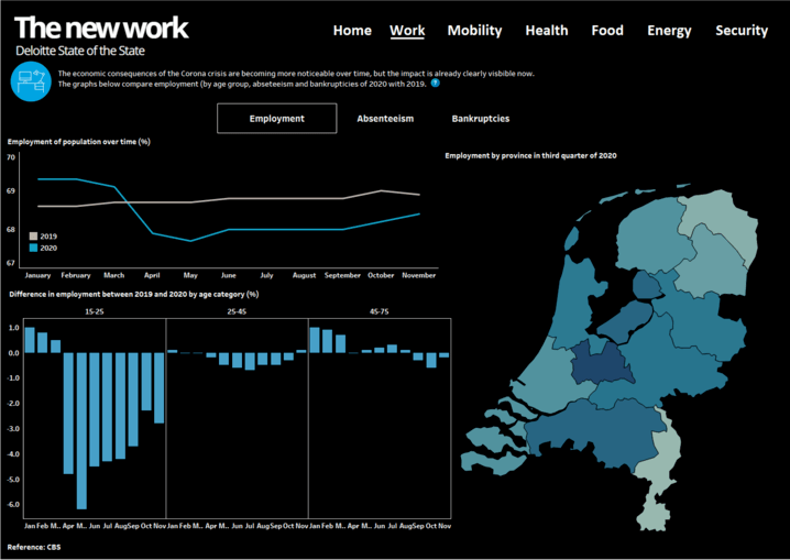
FEATURED BLOG SERIES

Data In the time of COVID-19: Lessons Learned

As we enter year two of the coronavirus pandemic, we know that to meet the as-yet undefined challenges of tomorrow, we need data. Recently we asked members of Tableau’s COVID-19 Advisory Board what they felt were the biggest data lessons learned since the beginning of the pandemic. The learnings were both practical and provocative.

Read the Blog Series

Back to School

As James Madison University (JMU) prepared for Fall 2020 classes, freshman parent and Tableau partner, Lee Feinberg, volunteered to help improve the school’s Stop The Spread dashboard. JMU’s commitment to data transparency, through both university- and self-reported cases, has contributed to more than 540,000 views of its COVID-19 dashboard as of February 2021.

Read the Blog Post

COVID-19, Starbucks and the third place

The pandemic has forced businesses to shift real-life activities to the digital world. For Starbucks, finding ways to still connect in a human-centric way required turning to data. They quickly developed a top line report to deliver the right data points to the right teams to gain a holistic view of what was happening in near real-time. It democratized the data and gave everyone the information they needed to make decisions and move forward.

Read the Blog post

A Path to Normalcy

As COVID-19 vaccines begin to roll out around the world, the question on everybody’s mind is: When will things get back to normal? We spoke to Samuel V. Scarpino of the Network Science Institute at Northeastern University to understand the five key variables that will impact how quickly we will get back to a state of “normalcy.”

Read the Q&A with Dr. Scarpino

See the path to Normalcy

Indiana COVID-19 Vaccine Dashboard provides at-a-glance insights

The Indiana COVID-19 Vaccine Dashboard features data detailing the state’s vaccination efforts, including first and second doses, county-level distribution, as well as providing aggregate demographic details of vaccine recipients. Originally published December 29, the dashboard has seen more than 460k views to date.

ACCESS MORE VACCINE MANAGEMENT RESOURCES

Vaccine Management Webinar

For nearly a year, as coronavirus cases have spread around the world, we have been counting up. With vaccines starting to roll out, we can hopefully start counting down. Anthony Young and Graham Stroman provide an overview of the solutions available to track data related to vaccine performance, facility readiness, inventory and patient prioritization and more - so that public and private organizations can effectively manage and communicate the countdown to normalcy.

The Data Culture Playbook

In the next normal, agility and innovation will be paramount to success. To achieve this, leaders are turning to data and cultivating a data-savvy workforce that can tackle even the most complex challenges. Prepare your organizational culture with the Data Culture Playbook, a step-by-step guide to building resilience with data.

Get the Playbook

Outbreaks Near Me

Outbreaks Near Me (formerly known as COVID Near You) is a collaboration between Boston Children's Hospital, Harvard Medical School, SurveyMonkey, and Tableau to visualize pandemic data in the US. The dashboard shows COVID-19 symptom data, along with information on political affiliation, education level, attitudes about mask-wearing, and healthcare access - all critical for equipping policymakers and local leaders with data to understand the factors that impact the spread of the virus in their region.

Learn more about Outbreaks near me

COVID-19 Data & Innovation Centre

What would it look like to bring together a wide range of pandemic data from across the globe, spanning different sectors and impact areas? Cepei, a nonprofit think tank, launched the COVID-19 Data & Innovation Centre in partnership the UN COVID-19 Multi-Partner Trust Fund, Tableau and others, to make accessible a wide range of data related to the pandemic’s economic effects, focusing primarily on the Global South.

LEARN MORE ABOUT THE DATA & INNOVATION CENTRE

COVID-19 US Retail Impact

The 2020 holiday retail season will be a season like no other. More than ever, retailers will need a deep understanding of their customers to meet expectations for a seamless, omnichannel experience. Understanding patterns of consumer behavior, including visitation patterns, can give retailers a competitive advantage by enabling a data-driven approach to forecasting and planning.

Check out the trends

Data-driven resilience

How important is it to be data-driven, especially during a pandemic? Tableau, in partnership with YouGov, commissioned a survey of senior managers and IT leaders in four European markets to understand what sets data-driven companies apart from their non data-driven peers. Discover how leading with data during the COVID-19 crisis helps companies feel better equipped to make informed decisions and face the future with confidence.

Explore the results

COVID-19 Worry Dashboard

More than seven months in, how worried are people about the impact of COVID-19 on personal finances and the economy? How does this break down by party affiliation, race, education, gender and age? This dashboard, created by Tableau in partnership with SurveyMonkey, offers broad insights from public opinion data collected during one of the most-watched election cycles in our lifetimes.

Interact with the viz

The impact of COVID-19 on civil aviation

COVID-19 is profoundly impacting air carriers, airports, and air navigation service providers around the world. Stakeholders need rich, actionable data insights to understand the impacts and inform decisions that are shaping the future of the aviation industry. ICAO, a specialized agency of the United Nations, in partnership with the Directorate General of Civil Aviation of Turkey, is using ADS-B FlightAware data to monitor the impact of COVID-19 on civil aviation in four areas: operational impact, economic impact, aircraft utilization, and country-pair traffic.

Interact with the viz

New York City weathers pandemic with data-first response

New York City was in the eye of the storm during the first wave of the coronavirus pandemic. Hear from Kelly Jin, Chief Analytics Officer at City of New York, as she explains to Tableau CEO Adam Selipsky how the city was able to leverage its data assets and craft an effective, data-driven response.

White House COVID-19 Outbreak Tracker

The recent COVID-19 outbreak at the White House generated immediate and widespread interest in contact tracing. Benjy Renton, Jesse O’Shea, and data visualization lead for the COVID Tracking Project, Peter Walker, created an in-depth dashboard to track the outbreak. The dashboard tracks contacts by event, test result time and category of individual affected.

Interact with the viz

COVID-19 Healthcare Coalition

Created by the COVID-19 Healthcare Coalition, this dashboard provides an initial look into how to quantify the level of vulnerability within a ZIP Code tabulation area (ZCTA). Vulnerability is found by layering three types of data: medical risk, social risk, and health care resource risk. Interacting with the data at this level guides local decision makers as they seek to understand the vulnerability of their populations, as well as the vulnerability of neighboring regions.

Interact with the Viz

United States Coronavirus Tracker

This dashboard from the Kaiser Family Foundation provides state-level trends as well as other metrics on testing and hospitalizations. The dashboard also includes a look at demographics, showcasing an analysis of how COVID-19 disproportionately affects communities of color and compounds underlying health and economic disparities.

Monitoring Cases to Inform a Gradual Reopening

The latest guidance states that US localities should have a “downward trajectory of documented cases within 14 days” before proceeding with a gradual, phased reopening. In this visualization, Christian Felix uses several different methods to show whether a locality is experiencing such a downward trajectory or a sustained reduction of cases.

Interact with the Viz

Dis/Misinformation Related to COVID-19 on Reddit

This dashboard from the COVID-19 Healthcare Coalition helps users discover dis/misinformation about COVID-19 on Reddit. Use the dashboard to explore which Subreddits tend to have more non-human or suspicious activity, defined as a "Suspicious Score."

Interact with the Viz

Higher Education Reopening Dashboard

Using data from The Integrated Postsecondary Education Data System and The Chronicle of Higher Education, Alex Ahlstrom of Simpson Scarborough visualizes how postsecondary institutions plan on reopening this fall. Browse different institution plans and filter by institution type, location, or enrollment size.

Interact with the viz

Forecasting Utilization Surges at the U.S. County-Level

To prepare communities for the surge of testing and treatment demands, the Cerner Intelligence team developed a county-level COVID-19 forecasting model to predict requirements and identify potential shortages before they happen.

Interact with the Viz

Explore more COVID-19 visualizations from the Tableau Community