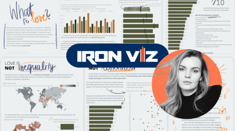
6 Lessons Learned About Data Communication from the Iron Viz Feeder


Last week I had the honor of announcing the winners of the 2021 Iron Viz feeder competition. The theme was joy, and the entries definitely brought me joy. Iron Viz is amazing, not just because of the skill of the people who make it to the top 10, but because of the talent of everyone who enters: win or learn, you can’t lose with Iron Viz. Whether it’s your first or tenth time entering, thank you!
As always with Iron Viz, I get the most joy from the small but important design flourishes, the little tweaks that advance the data storytelling, and the sometimes-hidden steps that elevate the data analysis. Here’s a list of the most impactful and reusable things I loved from this year’s top ten:
1. Don’t be afraid of “boring” bar charts
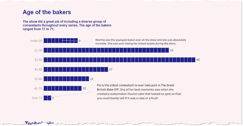
It can be tempting to go a long way and hack Tableau to create non-standard charts with deep visual appeal and a significant “wow” factor. Don’t forget, though, that you have an audience who want to understand your chart. For that reason, it might sometimes be better to stick to the basic chart types that best exploit the powers of our cognitive system. For competitions like Iron Viz, I especially like seeing standard charts embellished in some way. That shows a mastery of empathizing with your audience combined with design flair. Dinushki’s Great British Bake Off entry contains only line charts and variations on dot plots, and yet each has a little extra toughness to bring a bit more joy.
2. ... although sometimes elaborate charts impress in other ways
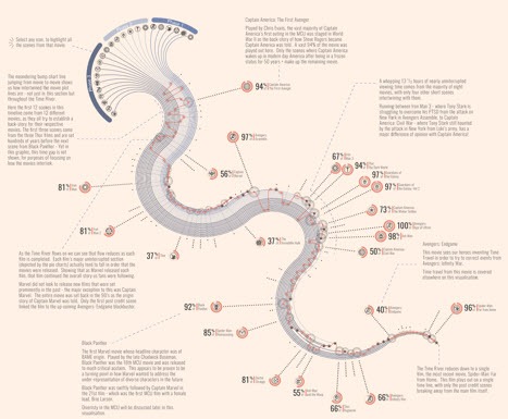
Some of you may have noticed Sam Parsons’ top three entry very much diverged from this advice. His submission was bananas in terms of custom charts and Tableau hacking. He definitely sacrificed quick readability in the pursuit of elaborate chart types, so how come he still got into the top three? Judging Iron Viz is about design, storytelling, and analysis. Design can incorporate Tableau mastery, and Sam rightly scored through the roof for this one. On top of that, his analysis and storytelling were exceptional. He took inspiration from National Geographic and the FT, and wanted to create something to be poured over and deeply engaged with.
Would I recommend this approach for your business dashboard? Heck no. But if we look at the work of people like Giorgia Liupi, it’s clear there is a place for the beautiful, elaborate pieces.
3. Color: use with intent
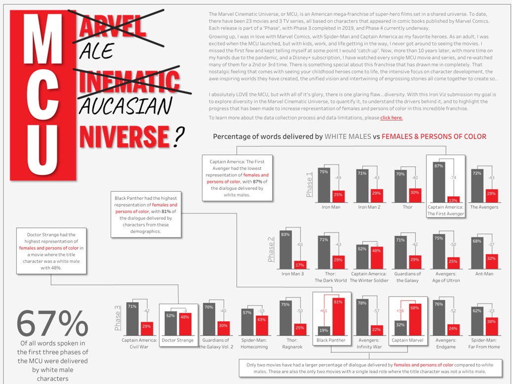
Correctly using color in data visualizations is an important skill. Beginners in the field are often tempted to go overboard and use too many. All the top ten used color correctly: with intent and restraint. Brian Moore’s Marvel Cinematic Universe analysis used grey and red. It shows that you can create impactful work with just one color.
4. Stories don’t have to be long-form: think about navigation buttons
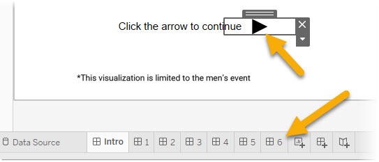
Ryan Soares’ Ten Seconds of Glory kept everything on a single screen. He still packed in multiple story levels, but he did it using a dashboard button and multiple dashboards. I liked the user experience of moving through these dashboards.
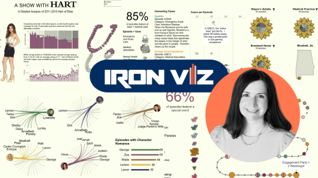
5. Radar charts are my #dataviz guilty pleasure
Radar Charts have serious flaws. That much is well-known and has been written about many, many times. And yet, they remain my data viz guilty pleasure. I love them. When trying to compare entities’ characteristics across multiple dimensions, the area that the radar creates is very effective, even though it’s an artificial construct. Despite their problems, they are used extensively in the medical fields, where research has shown they are more effective than bar charts of parallel coordinate charts, as described in this Harvard Business Review. (Note to everyone: I no longer judge the Iron Viz entries, so don’t add them to your next submission, hoping you’ll get bonus points from me. 😀)
6. An example of analysis, design, and storytelling in one component
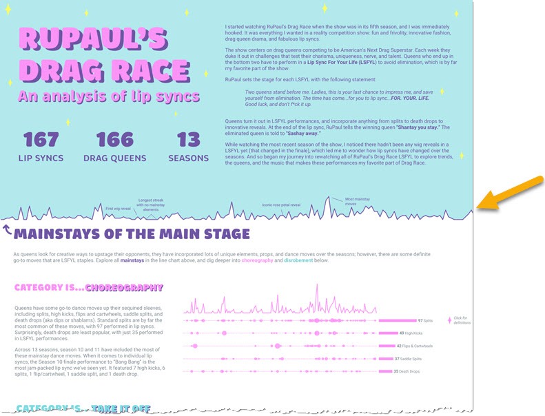
Iron Viz is about adding subtle and impactful flourishes to your work. My favorite in this feeder was in Lisa Trescott’s analysis of RuPaul’s Drag Race Lip Syncs. On first look, you might not register that the boundary between the blue overview and the white detail is anything special. But as you delve in deeper, you can see that the boundary is a data-driven one. In fact, it’s a core part of the analytics. I absolutely love this: design, analysis, and storytelling are all blended into one in this single timeline. Genius!
That wraps up my reflections on Iron Viz. I thoroughly enjoy the creativity across all the analysis, design, and storytelling from all the entries. I love the creative freedom Iron Viz gives analysts. Our work has to lean much more towards being functional and dry in our day jobs and focused on maximum readability in minimum time. Iron Viz is a chance to break out and use our skills to add flair. Thank you to everyone who entered.
Explore the Iron Viz gallery on Tableau Public to view all the Joy + Data entries from this year’s 2021 Iron Viz feeder competition, and be sure to save the date and tune in to the Iron Viz Championship at Tableau Conference 2021.
Zugehörige Storys
Meet Iron Viz 2024 Finalist Jessica Moon
 15 April, 2024
DataFam Roundup: April 8–12, 2024
 12 April, 2024
Meet Iron Viz 2024 Finalist Pata Gogová
8 April, 2024
Blog abonnieren
Rufen Sie die neuesten Tableau-Updates in Ihrem Posteingang ab.