Vanguard Charitable optimizes strategic grant making, cuts manual reporting by 50% with Tableau
Reduced manual reporting to donors and the organization by 50% in the first year
Enabled dynamic access to insights that help guide and shape philanthropy across 20K accounts
Maximized efficiencies and kept fees low via streamlined data operations
Vanguard Charitable is a public 501(c)3 charity and one of the largest charitable grantmakers in the US, helping more than 20,000 donors become strategic philanthropists by leveraging a donor-advised fund (DAF). A DAF is an account for charitable giving designed exclusively to invest, grow, and give assets to charities for meaningful and lasting impact. Vanguard Charitable has granted more than $10 billion to charities since its foundation in 1997, and generated more than $4 billion in additional funds for charities through investments.
“Our mission is twofold,” explained Vicky Kelberer, group manager of the 8-person Vanguard Charitable Research & Strategy team. “We're increasing charitable giving within our client community, and we're helping each client maximize the impact of their charitable dollars over time.”
Guiding targeted philanthropy using data
To accomplish this, the team persistently looks for opportunities to help donors overcome various challenges to charitable giving, and to target and optimize their investments in ways that are aligned with their unique philanthropic strategy. And it must all be done using methods that keep fees and costs as low as possible, in keeping with the overall Vanguard investment philosophy.
We achieved that 'sweet spot' in analytics where instead of spending 80% of our time wrangling data, it's more like 20% now, and the remaining time we can spend actually analyzing what's going on.
Not surprisingly, data is at the center of this process. “Our donors can't evaluate their strategies unless they have access to data and reporting,” said Kelberer. Until a few years ago, her team produced more than 150 customized reports for donors and the organization, using a fully manual process of downloading the data, wrangling it into spreadsheets and other static formats, and then reformatting each report for readability. As Kelberer points out, “If the report isn't easy to look at and follow, the client is less likely to engage with it and gain any real insights or productivity.” In 2018, the team piloted a program that used Tableau to shift from manual reporting to interactive analysis, using current data. Even with just a basic dashboard to start out, the pilot gained a great deal of traction. Our teams had faster access to changes, trends, and insights in the data, thanks to 30-minute refresh cycles. “Having fast, regular updates was groundbreaking for us,” said Kelberer. “Especially during our annual giving season—it spans November and December, but we never know in advance when the big donation volumes are going to hit. So, getting live updates every half-hour enables us to act in a much more nimble way.”
The new dashboards also help provide access and insights to all donors, who span a wide range of technical and financial know-how. "The donors' varying levels of experience guides all of our web design requirements and visualizations," said Kelberer. The immediate access to numbers also increases the organization's public relations capabilities by enabling it to provide philanthropic giving data upon request from outside agencies and media.
With Tableau, we can remove barriers and share information with donors much faster and more clearly, showing them the best path to follow through on their philanthropic strategy.
Data-driven results: Flipping the 80/20 analytics ratio
In the first year following the pilot, the volume of manual reports produced by Kelberer's team dropped to 50% of its previous number; this year, it got below 30%, and the goal for 2021 is zero—all custom data reported to donors and shared across the internal groups will be analyzed and presented in Tableau. This not only lowers operational overhead by reducing cycle-time goals for data management, but also empowers Vanguard Charitable to communicate more proactively with donors about making grants. And where donor reporting once occupied one person's time for four full days each month, the remaining reports require only a three-hour monthly download.
“We basically flipped the 80/20 ratio,” Kelberer said. “We achieved that 'sweet spot' in analytics where instead of spending 80% of our time wrangling data, that's more like 20% now, and the remaining time we can spend actually analyzing what's going on.”
And it's all in service to the organization's dual mission of promoting contributions from philanthropically minded investors and maximizing each donation's effect. Kelberer is especially proud of the ways Tableau has helped unleash her team's creativity, finding new ways that data can help Vanguard Charitable donors increase their charitable impact.
“Often the simplest things can get in the way of making a decision to give money to charity,” said Kelberer. “Using Tableau, our team can remove a lot of those barriers, and share information with our donors much faster and more clearly, showing them the best path to following through on their philanthropic strategy.”
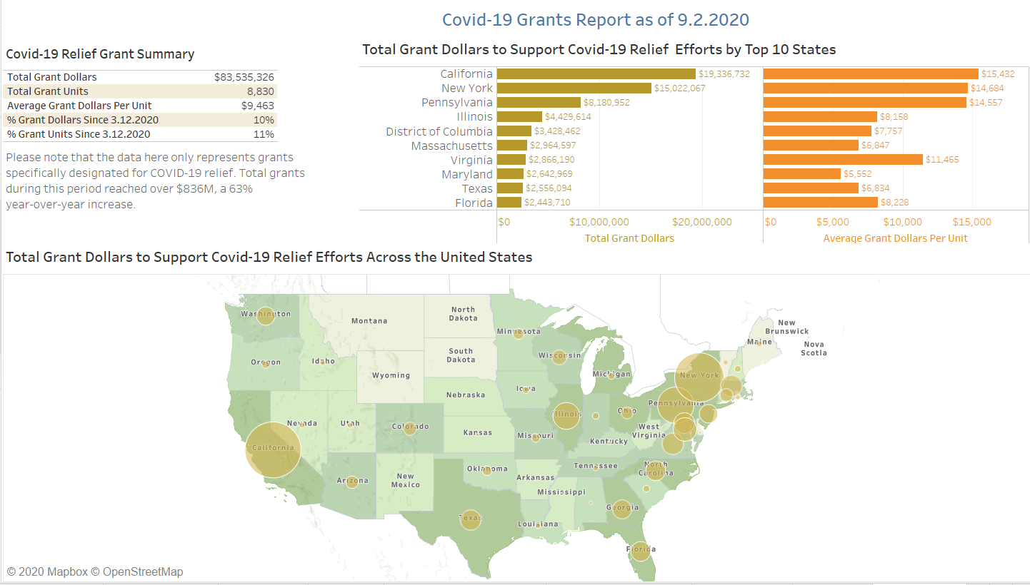
Vanguard Charitable recently launched the Nonprofit Aid Visualizer (NAVi), a web-based mapping tool that helps donors locate charities in areas vulnerable to the COVID-19 pandemic. By bringing together multiple datasets in a single interactive map visualization, NAVi enables donors to give to organizations making an impact in their local communities and across the US.