Pride Viz Gallery: Eve Thomas


Pride Month is a celebration of the impact that the LGBTQ+ community has had on making this world a better place. We are thrilled to be launching a new Pride exhibition in the Tableau Public Viz Gallery during the month of June - we hope you’ll take the time to explore the gallery and walk away feeling like you learned something new.
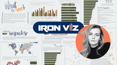
This week we sat down with Eve Thomas, one of the authors featured in this year’s pride exhibition, to talk about her viz THE TRANS REPORT - Transgender Inequality in the UK and her experiences with the Tableau Community.
We are also looking forward to hosting our next Data + Diversity event at the end of June - for updates check here.

Explore THE TRANS REPORT - Transgender Inequality in the UK visualization by Eve Thomas
Before we get started, tell us about yourself and your involvement with the Tableau Community.
I am a data visualization consultant with The Information Lab UK and a The Data School UK graduate – before I discovered the magic of Tableau my background was in teaching and HR. I have a passion for education and promoting equal opportunities – to me promoting diversity, equality, equity, and awareness in the public sphere is vital, particularly in light of the events to which we have all been witness over the past two years. For this reason, I love to create data visualizations that help to educate others – Tableau is the perfect platform to do this! I am an active member of the data community and I co-lead two initiatives that aim to promote these key values: Diversity in Data and Viz 2 Educate.
We recently launched a Pride exhibit in the Tableau Public Viz Gallery and your viz ‘THE TRANS REPORT - Transgender Inequality in the UK' was featured. Can you tell us a bit about what inspired you to create this visualization?
The key reason why I created this visualisation was to highlight the profound impact that discrimination, violence, and exclusion are having on trans people’s quality of life in the UK. According to the Transphobic Hate Crime Report 2020 published by LGBT+ anti-violence charity Galop, trans people are under such high rates of physical, sexual, and verbal attack that more than half feel less able to leave their home, with a quarter of trans people having experienced or been threatened with physical assault in the last year. Though more is now being done to tackle hate crime in the UK, I believe that trans hate crimes often go unreported/are misreported by the media. By creating this viz I hope to increase visibility, knowledge, and literacy around this topic.
What were you hoping to accomplish with this visualization?
One thing that really struck me during my research was how often hate crime against trans people goes unreported; four in five trans people don’t report it to the police. One reason for this is that some trans people who report a hate crime don’t feel that they are supported by the police or fear they will experience further discrimination as a direct result. By highlighting this issue, I am not only hoping to help spread awareness but also to facilitate further public conversations around this important issue which I hope will help to encourage victims to speak out.
While you were creating this visualization, what were some of the findings that struck you the most?
For me, all of the figures were really shocking. I think what struck me the most was the level of discrimination trans people face on a daily basis and the profound impact that has on their everyday life. According to the report, 48% of trans people don’t feel comfortable using public toilets, 44% avoid certain streets altogether from fear, and 34% said they had been discriminated against when going out for food and drinks - all things I take for granted.
What do you hope that people take away from interacting with this visualization?
For me it’s more about putting percentages on a page—it’s also about getting a conversation started. I hope people will see this viz as a starting point—trans hate crime is happening everywhere – not just in the UK. Do your research—find out what the situation is in your home country/ hometown and please make an effort to support trans people in your community.
Are there any other diversity-related visualizations you’ve seen on Tableau Public that have stood out to you over the last year? If so, which ones?
I have so many! There are so many amazing authors out there it is difficult to pinpoint my favourites ...
Damola Lapido: Damola’s keen eye for design shines through in his ‘Must Read Books by Black Authors - recommended by Ted speakers’—it doesn’t surprise me that this earned a Viz of the Day feature. Not only does this viz highlight incredible literary work by Black Authors, but it is also a call to action to support Black-owned book shops. I also love the fact that this viz has a practical use—I was checking this out during lockdown when I found myself needing a good book to get through quarantine! If you haven’t already then be sure to check it out!
Soha Elghany: It was difficult to choose just one of Soha’s vizzes to focus on. For me her work is illuminating—I am always in awe of the powerful, and often personal stories that she uncovers and then brings to the attention of the data community. If you haven’t checked out her work already then you need to! Here are a few of favourites below to get you started:
- ‘Black History’
- ‘Vogue - Colourism in High Fashion’
- ‘Migrants Missing and Dead’
- ‘The Shape of Slavery’
Autumn Battani: One thing that Autumn and I loved about this month’s joint round of #DiversityInData and #IronQuest was that so many people chose to focus on the successes of individuals within the Black, Asian, and minority ethnic community. For us, though it’s important to highlight the lack of diversity/equality/equity felt by many, it is also really important to celebrate the positive and highlight the achievements of individuals from these underrepresented communities.
Autumn’s Viz ‘All Hail the King: The Film and TV Career of Regina King’ is an all time favourite for this reason!
Dzifa Amexo: I found this viz by Dfiza really insightful - it looks at statements and actions made by technology companies in Corporate America in relation to the Black Lives Matter movement. I also love the way Dzifa has approached the design of this viz by way of a story - it has impact: ‘Walking the Talk: Do Black Lives Matter in the Tech Industry in Corporate America (Fall 2020 Capstone)’
Knowing what you know now, what would you tell yourself as a beginner creating vizzes with Tableau Public?
Don’t be afraid to ask the community for feedback! I genuinely believe that the best way to improve is to learn from others - the online data community is such a welcoming and friendly place and I have found that people are always willing to give you feedback to help elevate
your viz to the next level!
You’re a super-engaged member of the Tableau community - what are some of your favorite diversity, equity, and inclusion-related resources or initiatives?
There are so many great community initiatives that spring to mind which I encourage everyone to get involved in!
Diversity In Data is an initiative centered around diversity, equity & awareness. Each month we provide datasets that we hope the data community will help us to visualize. We encourage you to analyse the data, elevate stories from it and then share them with us. We try to provide datasets covering a multitude of topics such as race, gender, disability, and mental health. Help us start the conversation! Find monthly datasets here.
The SDG Viz Project is another great one to get involved with. Each month the project aims to visualise one of the 17 Sustainable Development Goals (SDGs) adopted by all United Nations Member States in 2015 as part of the 2030 agenda for sustainable development. Read more about the initiative here.
I’ve also really enjoyed participating in Makeover Monday for Viz 5. In 2020/2021 for 1 week of every month Makeover Monday partnered with OpFistula, providing datasets aiming to shine a light on the extreme gender inequality felt in many countries around the globe to find out more and access the data click here.
Related stories
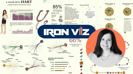
Meet Iron Viz 2024 Finalist Jessica Moon
 15 April, 2024
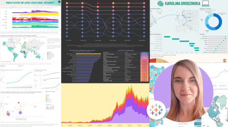
Meet Iron Viz 2024 Finalist Pata Gogová
8 April, 2024
Student to BI Analyst, How Tableau Can Lead to a Successful Data Career
 20 March, 2024
Subscribe to our blog
Get the latest Tableau updates in your inbox.