Back to school: JMU parent helps improve university’s COVID-19 dashboard


Data visualization is a collaborative exercise. Sometimes help comes from unexpected places. As James Madison University (JMU) prepared for Fall 2020 classes, freshman parent and Tableau Partner, Lee Feinberg, volunteered to help improve the school’s Stop The Spread dashboard. JMU’s commitment to data transparency, through both university- and self-reported cases, has contributed to more than 540,000 views of its COVID-19 dashboard as of February 2021.
Editor's note: this story was originally published on James Madison University News.
Parent volunteer helps revamp COVID-19 dashboard
JMU had one of lowest totals of infected students among Virginia’s big publics
SUMMARY: Lee Feinberg, a data visualization consultant and proud JMU parent, volunteered to help the university improve its COVID-19 dashboard, which has since become a model in higher education for keeping community members informed.
By Khalil Garriott (’04)
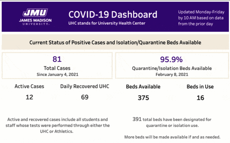
Ahead of the first day of Fall 2020 classes—and to ensure transparent access to information about the prevalence of COVID-19 in the James Madison University community—the university published a COVID-19 dashboard, which includes a number of data points, including positive cases involving JMU students and employees. The Tableau-driven dashboard, updated Monday through Friday with daily and accumulated (seven-day moving average) data, received strong marks in the Rate COVID Dashboards Project, a Yale University-led ranking system.
A unique aspect of this product is the JMU connection. Lee Feinberg, a parent of a current JMU student, has been crucial to the success of the dashboard.

“I looked at it and said, ‘It’s good that they’re doing this, but it could be a lot better,’” said Feinberg, whose area of expertise is data literacy.
Feinberg proactively reached out to JMU’s Office of Institutional Research and volunteered to help with the JMU COVID-19 dashboard. He has been working with the Tableau Foundation for almost nine years. His daughter, Aliyah, is a freshman forensics and hospitality double major from New Jersey.
“I just picked up the phone and called and said, ‘I’m a parent, and I’d love to help you for free if you want it,’” Feinberg said. “I’ve done this before, and it was easy for me to see the need and jump in.”
The dashboard became a big way to communicate with the university community. There have been more than 539,900 page views of the dashboard. On Sept. 14, 2020, JMU launched a Stop the Spread Helpline, which has answered 886 inquiries (calls and emails) to date. Of those 886 questions, seven calls and 17 emails were pertinent to the dashboard.
Chris Orem, director of institutional research at JMU, said his office has used Tableau for about a decade, but only within the last several years has it truly leveraged it as a data visualization tool.
“JMU leadership uses it to make decisions and understand the scope of what’s happening here,” Orem said. “I thought I’d be a fool not to take this free consultation advice, so it made a lot of sense to reach out to Lee to see what he had to offer.”

One of the criteria in the Yale-led rubric is whether an institution’s dashboard is easy to read. After JMU’s dashboard launched, Feinberg scratched his head.
“What occurred to me first is that I wasn’t sure what I was looking at,” he said. “There were a lot of different terms and numbers, and it was confusing to me. My son goes to Pitt (the University of Pittsburgh), and they weren’t really promoting it in the same way. I was having trouble with this, so I have to imagine that other people were.”
Feinberg and Orem had several calls, totaling probably a day’s worth of time collaborating on the dashboard. “My goal also was to help Chris, as someone new to Tableau, with the thinking,” Feinberg said. “We spent time talking about things, and Chris came back with ideas.”
Orem said, “It’s been great to go back and forth and make this into a tool … for everyone to interpret it. The need to improve it was apparent.”
In 2012, Feinberg founded DecisionViz, management consultants specializing in data visualization. His company is a certified Tableau Software Silver Services Partner, and he is well versed in visual analytics best practices and capabilities of products within the Tableau platform.
JMU has taken a holistic approach to data to help the university navigate COVID-19. Tableau has helped tell that story via its COVID-19 Data Hub.
“The data hub is really meant to provide guidance to the community overall on anything at all related to COVID-19 data,” said Jeremy Blaney, director of Tableau blueprint product manager. “It has a pretty broad audience. Over the past few months, we’ve used it more and more as a storytelling platform."
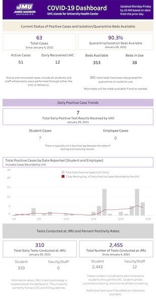
Among the pillars of the redesign were simplifying it, changing language and terminology, reducing redundancy, making numbers more easily understandable and revamping the color key.
“At Tableau, we’re all about helping people see and understand data,” Blaney said. “I could immediately see where JMU stands with respect to COVID-19. I think it’s a really effective dashboard, not just among universities but overall.”
A unique transparency feature of JMU’s COVID-19 dashboard created an unintended consequence. After JMU students returned to campus in early October 2020, everyone followed the Stop the Spread guidance faithfully, and JMU had one of the lowest numbers of active COVID-19 cases among the big public universities in Virginia as a result.
JMU was incorrectly cited to be the worst large public institution in the state for COVID-19 infection rates because it was the only big public to report not just students testing positive in the University Health Center—but also students who tested elsewhere and self-reported. When compared to peer institutions like Virginia Tech, for example, JMU’s numbers were far lower, but the university’s commitment to transparency gave the impression that the numbers were far higher. (This misperception was reported by The Roanoke Times.)

Students’ acceptance of the Stop the Spread guidance was key to JMU’s low case counts. Upon the beginning of the Spring 2021 semester, the university encouraged that positive behavior to continue, buoyed by entry testing and surveillance testing.
JMU did not have the highest percentage of infected students among the big publics. In fact, it had far fewer students testing positive on campus than other large Virginia public institutions did. It was just reporting more transparently.
“JMU leadership was keen, from the start, to be open about our cases,” Orem said. “The challenge came with how to showcase that.”
Historias relacionadas
After a year of COVID-19 charts, eight data communication lessons learned
 19 Abril, 2021

4 reasons why embedded analytics is your path to a new revenue stream in the COVID-19 era
This blog post covers four reasons why organizations should consider embedded analytics.

What we can learn from the public sector’s response to COVID-19
 21 Mayo, 2020
A broad consensus is that COVID-19 will drive digital transformation in the public sector. During the 2020 Government Summit, speakers from Veteran Health Administration, Southwest Texas Regional Advisory Council, and FEMA discuss new processes, new technologies and innovations, and most importantly, a new mindset on decision making in the midst of crisis.
Suscribirse a nuestro blog
Obtenga las últimas actualizaciones de Tableau en su bandeja de entrada.