Pride Viz Gallery: Max Tham


Pride Month is a celebration of the impact that the LGBTQ+ community has had on making this world a better place. We are thrilled to be launching a new Pride exhibition in the Tableau Public Viz Gallery during the month of June - we hope you’ll take the time to explore the gallery and walk away feeling like you learned something new.
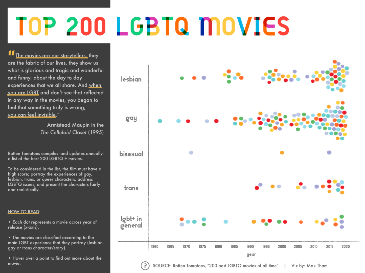
This week we sat down with Max Tham, one of the authors featured in this year’s pride exhibition, to talk about his viz ‘Top 200 LGBTQ Movies’ and his experiences with the Tableau Community.
We are also looking forward to hosting our next Data + Diversity event at the end of June - for updates check here.
Before we get started, tell us about yourself and your involvement with the Tableau Community.
I am a social science researcher and I mainly viz for work to communicate research insights about educational topics & youth studies. I also viz for personal research projects and to learn new viz techniques.
I started learning Tableau in 2019, and during 2020 I participated at least once a month in community challenges such as Makeover Monday and Storytelling With Data. In those challenges, I have been able to work on the topics that are more interesting to me, such as education, culture & gender equality, and Latin American realities. I am also trying to publish vizzes in Spanish so I can connect with local data viz people.
When I was selected as a Tableau Public Featured Author in June 2020 I was able to connect with different members of the Tableau Community, especially on Twitter. My favorite part of Tableau Public is to get inspired by what other people are doing and to learn from their work. Most people in the community are receptive and generous.
We recently launched a Pride exhibit in the Tableau Public Viz Gallery and your viz ‘Top 200 LGBTQ Movies' was featured. Can you tell us a bit about what inspired you to create this visualization?
Well, I love watching movies, and as a member of the LGBTQ+ community, I am always looking for films that portray the diverse experiences of LGBTQ+ people.
During that time, I also had the opportunity to watch a documentary by Sam Feder and Amy Scholder called Disclosure, which looks at transgender depictions in film, and shows the relationships between trans representation on screen, society’s beliefs, and the reality of trans lives. That documentary was eye-opening about the power of film in society, so I wanted to design a viz where you could easily explore and learn about the most iconic LGBTQ+ movies.
Do you have a favorite movie that is featured in this visualization?
So many! But if I can pick three, I would choose the Chilean movie A Fantastic Woman by Sebastián Lellio, the now-classic documentary Paris is Burning by Jennie Livingstone, and A Single Man by Tom Ford.
While you were creating this visualization, what were some of the findings that struck you the most?
The selection of movies was based on the Rotten Tomatoes curated list. When I classified the movies in one of the five categories (lesbian, gay, bisexual, trans, LGBTQ+ in general), what was surprising was that films that portray the experiences of trans and bisexual people were significantly less present in the list. That could mean two things: fewer movies are being produced about those groups, or critics are not seeing or considering them. In both cases, this is something that the industry needs to improve to achieve more diversity.
What do you hope that people take away from interacting with this visualization?
I believe movies are a powerful way to generate empathy, they are a medium through which people can put themselves in the shoes of LGBTQ+ people, connect with them, and appreciate them. If one person, by interacting with this viz, gets curious about a film and decides to watch it I think I can be grateful.
Are there any other diversity-related visualizations you’ve seen on Tableau Public that have stood out to you over the last year? If so, which ones?
There are so many! I spent a lot of time in the Viz Gallery watching some visualizations that I missed last year.
One of my favorites is ‘The Unequal Impacts of COVID-19 on the LGBTQ and Transgender Communities of Color’ by Alexander Vassilev. I think the analysis is really powerful, the design is visually appealing, and it has an important call to action.
I know it’s not from last year but I would also highlight the viz “What makes a winner, baby”, by Mark Corbridge. It’s creative and describes a TV show known for highlighting diversity.
For someone who's just getting started with Tableau, what advice do you have for them?
Practice and connect. I guess that is what everyone says, but I think you learn by doing and creating new visualizations, no matter how they look at the beginning. Get involved in community projects, connect with other people in the field and the Tableau Community to get feedback, learn new tips, and get inspired.
Autres sujets pertinents
Meet Iron Viz 2024 Finalist Jessica Moon
 15 avril, 2024
Meet Iron Viz 2024 Finalist Pata Gogová
8 avril, 2024
Student to BI Analyst, How Tableau Can Lead to a Successful Data Career
 20 mars, 2024
Abonnez-vous à notre blog
Recevez toute l'actualité de Tableau.