Tableau and Outbreaks Near Me puts the 'public' back in public health


Outbreaks Near Me (formerly known as COVID Near You) is a collaboration between Boston Children's Hospital, Harvard Medical School, SurveyMonkey, and Tableau to visualize pandemic data.
As the COVID-19 pandemic has persisted for nearly an entire year, one thing is clear: No matter how much data exists on the virus, it’s never enough.
Specifically in the US, COVID-19 testing is not happening at the volume required to produce truly representative data, says John Brownstein, chief innovation officer at Boston Children’s Hospital. But that’s just one layer of the necessary data. Underneath key epidemiological metrics like cases, test positivity rate, and deaths are social and political factors, like mask-wearing and access to healthcare, that influence how the pandemic spreads.
Brownstein and Boston Children’s Hospital have teamed with Harvard Medical School, SurveyMonkey, and Tableau to create Outbreaks Near Me (formally COVID Near You), an effort to collect and visualize crowdsourced data on the pandemic in the US. While the recently renamed Outbreaks Near Me has been ongoing since nearly the beginning of the pandemic, the relaunched dashboard reflects an expanded view of relevant data for understanding COVID-19. The revamped dashboard, filterable by state, now shows self-reported COVID-19 symptom data, along with data on political affiliation, education level, attitudes about mask-wearing, healthcare access, and more. All of these metrics are critical for understanding COVID-19 in communities, Brownstein says. Their aim is that the new dashboard will provide more insights and detailed information to people who self-report their data—and equip policymakers and local leaders with a tool to understand the factors that impact the spread of the virus in their region.
A need for self-reported symptom data
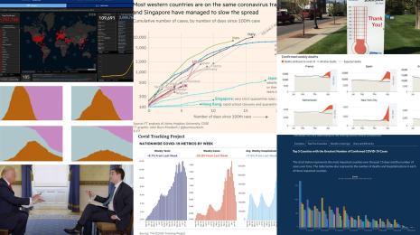
COVID-19 has turned a spotlight on the need for crowdsourced data. In addition to Outbreaks Near Me, initiatives like COVID Tracking Project, a volunteer-led effort to compile data on cases, hospitalizations, and deaths have formed in response to a lag in federally coordinated data collection.
But the need for better data on the prevalence of disease symptoms in a community predates the current pandemic, Brownstein says. “We embarked on a journey of crowdsourcing disease information close to 10 years ago,” he says. “We had a lack of information about illness in the community. Obviously we do get information about people interacting with healthcare providers and testing data, but general symptoms in the community, which represents the vast majority of the way illness presents, goes completely unreported.” Boston Children’s Hospital and partners launched a program nearly a decade ago called Flu Near You (an effort inspired, in part, by the movie Contagion), through which people could self-report symptoms through a web portal. “We wanted to put the ‘public’ back in public health by engaging people directly in the surveillance of emerging infectious diseases and making everyone an active participant,” Brownstein says. Flu Near You is ongoing today, and provided the blueprint for BCH and its partners to quickly develop Outbreaks Near Me this year.
Outbreaks Near Me: Meeting the need for data during the pandemic
Similarly as with Flu Near You, the team behind Outbreaks Near Me wants to encourage people to get engaged with producing much-needed public health data during COVID-19, and to provide a way for participants to understand the spread of the virus in their community. Since the launch of Outbreaks Near Me, Brownstein says, there have been millions of data points on individual symptoms entered into the platform, which have translated into insights about spread in communities that the Outbreaks Near Me team has been able to share with major players like the Centers for Disease Control.
Because the initial launch of Outbreaks Near Me relied primarily on people learning about the platform and opting into self-reporting their data, there are some gaps in the data. “Our data skews slightly older, and slightly more toward people that think about public health and want to engage,” Brownstein says. There are also geographic disparities. “We have much more engagement from the coastal states, and relatively less in the center of the country. We have to account for that and be considerate in how we extend our findings.”
Reaching a broader audience with SurveyMonkey
Partnering with SurveyMonkey is enabling Outbreaks Near Me to account for some of the gaps and biases in their self-reported data. SurveyMonkey, through its online polling infrastructure, has access to a wide range of people—nearly 2 million daily users. Outbreaks Near Me is working closely with SurveyMonkey to bring even more data into the platform, and understand how to turn the data they capture into nationally representative information, Brownstein says.

SurveyMonkey has also enabled Outbreaks Near Me to broaden the kinds of data points flowing into the platform. “Beyond the basic data on symptoms, we’re now able to get to a greater depth of information about people’s testing status, their attitudes and beliefs toward things like mask-wearing, social distancing, travel and their political affiliation,” Brownstein says. Outbreaks Near Me has been able to see, through these data, how attitudes toward mask wearing affect COVID-19 transmission in communities. They’re also capturing data about travel and indoor gatherings, which could correlate with potential outbreaks around the holidays.
“Not only does that give us more information, but it also enables us to provide that data back to everyone who visits the platform, which is so critical both for people seeing the value of the platform, and staying engaged and providing information in the future,” Brownstein says.
The value of visualization
“With all this data coming in, we need to be sure that we’re providing value back to the users by making it accessible and understandable,” Brownstein says. “That’s where the partnership with Tableau comes in.” By visualizing the layers of data in Tableau, Outbreaks Near Me makes it possible for visitors to clearly identify patterns and correlations in the data and see important patterns as they’re emerging. “The data comes to life,” he says.
The other essential purpose of having Outbreaks Near Me’s data in Tableau is to make it actionable for a wide range of stakeholders. “Our view is that it’s important to give people the tools to look at the data in different ways,” Brownstein says. “The public may be more interested in trends in their areas, and public health agencies that we work with may be more interested in how interventions like mask-wearing are working at a large scale.” With so much to discover in this data, Outbreaks Near Me’s aim is to provide a flexible way to query the data and make discoveries through Tableau. “Our hope is that by making this information open and available, people will be able to make findings that we might not have expected, or see important patterns that are just emerging.”
To learn more about data for COVID-19 tracking and response, visit Tableau’s COVID-19 Data Hub.
관련 스토리
After a year of COVID-19 charts, eight data communication lessons learned
 2021/04/19

4 reasons why embedded analytics is your path to a new revenue stream in the COVID-19 era
This blog post covers four reasons why organizations should consider embedded analytics.

What we can learn from the public sector’s response to COVID-19
 2020/05/21
A broad consensus is that COVID-19 will drive digital transformation in the public sector. During the 2020 Government Summit, speakers from Veteran Health Administration, Southwest Texas Regional Advisory Council, and FEMA discuss new processes, new technologies and innovations, and most importantly, a new mindset on decision making in the midst of crisis.
Subscribe to our blog
받은 편지함에서 최신 Tableau 업데이트를 받으십시오.