How to dive deeper into your survey data


Note: The following is a guest post by Tableau Zen Master and former Iron Viz champ Steve Wexler.
It’s never been easier to glean great insights and craft compelling visualizations with survey data. We’ve just updated our whitepaper to show just what you can do with Tableau and a little data-preparation work.
Getting the data in the right shape
The number one impediment for visualizing survey data was, and remains, getting the source data in a format that plays nicely with Tableau.
You probably already know you need to reshape the data. Instead of one row per respondent, you want a separate row for each question the respondent answered. But you can go even a step further to combine both text and numeric responses as well as add survey metadata.
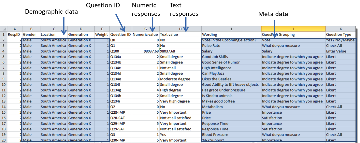
Behold, survey data nirvana! Label responses, numeric responses, logical groupings, and mapping of question IDs are all in a human-readable form that Tableau will love.
While this may take a little more effort upfront, the payoff is well worth it. And there are several tools to help you get your data just so.
Tools to get your data in the right format
You’re probably familiar with the Tableau add-in for Microsoft Excel as a tool for reshaping your data. There are several new approaches that can also help. These include Tableau’s new built-in pivot feature, the Qualtrics web data connector, and Alteryx Designer. (Check out the whitepaper for a summary of these technologies.)
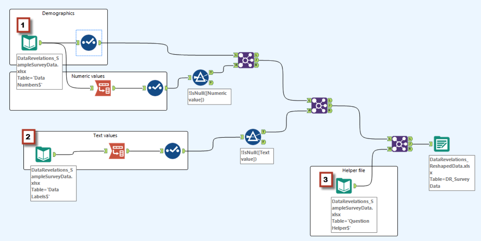
Here's an example of an Alteryx Designer survey-data workflow.
Oh, the possibilities with survey data and Tableau!
Looking for examples of what you can do with correctly-formatted data and Tableau? Here’s an example of how you can show sentiment. The viz below shows the percentage of people who believe things are better off now than when they were children.
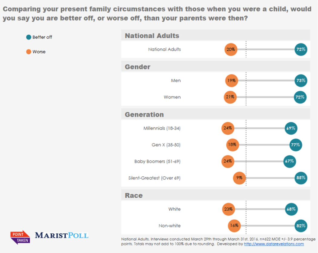
This divergent lollipop chart shows positive and negative sentiment (source: PBS, Point Taken).
And this example of a personalized dashboard shows one employee’s performance compared with that of his or her peers.
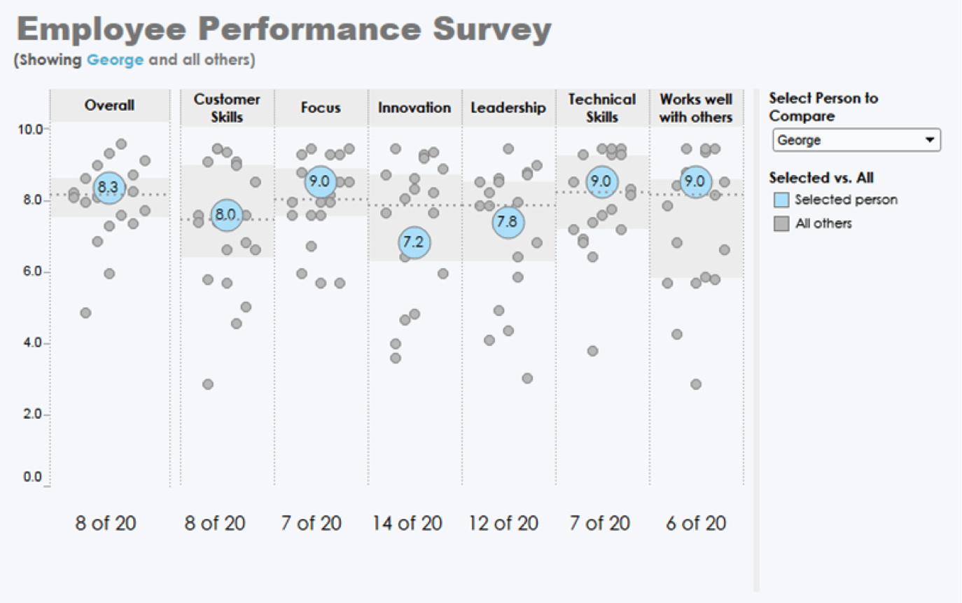
This dashboard shows an individual’s performance versus that of his or her peers. The manager can select the individual from the pick list in the upper-right corner.
We’ve added many more new examples to the whitepaper, including ways to visualize check-all-that-apply questions, Likert-scale questions, Net Promoter Score questions, and techniques to show statistical significance.
If you’re going to go to the effort to build and deploy a great survey (or surveys), why rely on underpowered analytic tools and their attendant visualizations to glean and share insights?
There is so much more you can achieve, from discovering new relationships through ad hoc analysis to combining disparate data sources with blending, to crafting infinitely more interesting and insightful visualizations.
With a little work to get the data set up properly and with the right tools to interrogate and visualize your data, you’ll get a better, deeper understanding of your users.
To learn more about visualizing survey data, check out our updated whitepaper.
Steve Wexler will present an online class on visualization survey data on June 15 and June 16. Click here for details.
Verwante verhalen

How Team USA uses data to build a digital HQ
 8 februari, 2022
Datatrends 2022
 3 februari, 2022

Healthcare Analytics Hub Starter Kit: Get the data you need faster
 18 oktober, 2019
The purpose of the Healthcare Analytics Hub Starter Kit is to provide a sample of what your healthcare app could look like. It’s not a complete solution; instead, it’s focused on what’s possible. Please contact your Tableau Account Manager to get started today!
Subscribe to our blog
Ontvang de nieuwste updates van Tableau in je inbox.