Verizon uses Tableau COVID-19 Data Hub to amplify dashboards that enhance customer service during the pandemic
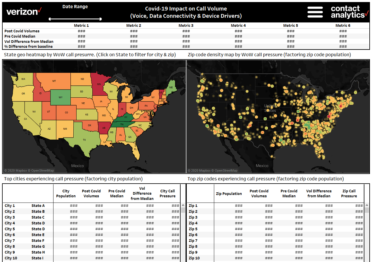
Created COVID-19 impact dashboards with heat maps to identify geographic areas requiring service
Used location-based analytics from Tableau dashboards to monitor service pressure related to device, voice, and data connectivity
Adapted dashboards with COVID-19 data to see spikes in service demand relative to pre-pandemic levels
Verizon uses multiple Tableau dashboards to manage and optimize its day-to-day customer service operations. State-of-the-art analytics and easy connectivity to a variety of data sources have helped Verizon produce a culture of excellence that anticipates and addresses customer needs across multiple touch points, including call center activities, customer contact via web apps and other digital channels, and even technicians' interactions with customers while out in the field.
Maintaining customer service quality became more vital than ever with the onset of the COVID-19 pandemic, as customers put increased demand on Verizon's networks. During April 2020 alone, customers placed more than 800 million calls per day—double the amount at the highest peak during a typical year. Calls were an average of one-third longer, text messages spiked to 9 billion daily, gaming on the network was up by 100%, and the number of people using virtual private network (VPN) connections to do their job went up by more than 50%. These increases, combined with Verizon's own priority of keeping its work environment safe for employees, drove the customer service organization to brainstorm new ways of meeting customer needs using available resources.
The team adapted their dashboards to incorporate data from the Tableau COVID-19 Data Hub, enabling them to see spikes in service demand relative to pre-COVID median levels, and adjust resources accordingly. It also helped them understand how their call data can inform them about spikes in network issues. In addition, they created new COVID-19 impact dashboards like the Call Driver Outlier and Anomaly Detection System, which helped them understand how the landscape was changing post-pandemic with respect to customers' calling behavior. The team built innovative prototypes showing heat maps of call center and technician dispatch activities, helping to identify geographic areas requiring service so the Verizon workforce could make intentional decisions about how to respond.
The pandemic has accelerated digital transformation exponentially. 5-year roadmaps are compressed into six months. Getting insights from our Tableau dashboards in near-real time puts us in a better position to serve our customers during the crisis.
Key to some of these activities was the Tableau COVID-19 Data Hub web data connector. “Using the web data connector, we blended Johns Hopkins University's pandemic data with our own internal customer service operations data,” explains Siddharth Dayama, Senior Manager of Data Analytics and Customer Service Operations. “This helped us correlate location-based spikes in service demand with COVID-19 hotspots around the country. This ability to seamlessly bridge insights from external world macro factors to our company's internal operational metrics is a game changer and helps us better understand the impact and make informed decisions.”
Amid all this change, Verizon also retrained more than 20,000 retail store operators and other call center customer service employees to continue their duties from workstations in their own homes, with access to all the same dashboards and other tools needed to perform in their roles, as part of the company's home-based work platform.
“Personally, I am very proud of our response capacity throughout this crisis,” said Dayama. “Verizon's networks withstood the additional pressure, and the company retained and retrained their professional workers—all while continuing on the mission to help customers stay connected during a difficult time.”
The flexibility and extensibility of Verizon's Tableau platform also helped with business continuity by enabling daily reporting across departments. “The beauty of dashboards versus static reporting is that the data IS the content, so when the data changes, the content is updated automatically, showing the latest trends,” Dayama explained. “And Tableau is built for 'learning by doing'—so when COVID-19 hit and we had new challenges to solve for, we could jump right in to start creating and modifying dashboards that met those needs.”