仪表板构建原则
了解构建可指导行动且信息丰富数据分析仪表板的一些最佳做法。


仪表板是传达数据见解的必备工具,但要构建出色的分析仪表板(即真正信息丰富、可以指导行动的仪表板),仅将所有“顿悟”放到画布上是不够的。以下是一些最佳做法,介绍如何入手,需要包含哪些内容,需要避免哪些错误,让您的仪表板脱颖而出:
1.务必考虑受众,为他们进行个性化设计。
创建对用户有意义的仪表板,使他们能够结合自身情况理解并吸取仪表板中的关键信息。

2.务必开展实验,反复改进,最重要的是获取反馈。
要使仪表板毫无破绽,您可能需要花较长的时间,而且往往需要反复修改。除了反复修改以满足您的需求外,请务必获取多个用户的反馈,确保仪表板对其他人也具有实用性。

3.务必使用大字号数字 (BAN)。
人们容易被大字号数字吸引,所以将其用于吸引受众的注意力。

4.切勿认为受众知道从哪里开始。
请在工作表或筛选器标题中提供操作说明,确保查看者了解如何更好地使用您的仪表板。

5.切勿尝试一次性回答所有问题。
仪表板的用途是传达几条关键信息,没有必要一次性介绍您发现的所有见解。在同一个仪表板中显示过多内容,会导致信息过载。

6.切勿过度设计。
功能的重要性大于外观:您应该力求简洁。

阅读更多的仪表板最佳做法,通过 “仪表板的设计原则” 白皮书查看可视化示例。
相关故事
Tips & Techniques
How to Use the Intersects() Calculation in Tableau
 2023/03/27
Learn about the Intersects calculation in Tableau, which allows you to find spatial intersections via calculated fields at the workbook level—rather than in a join.
From the Community
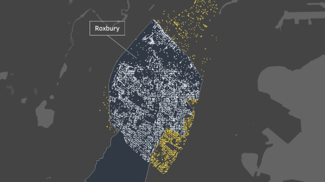
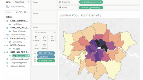
A Guide to Mapping and Geographical Analysis in Tableau
 2022/10/25
Learn the basics of mapping in Tableau, how to create maps, use layers, area calculations, and other mapping features from Tableau Visionary Marc Reid.

Tips & Techniques
5 tips for mobile-first dashboard design in Tableau
 2019/12/03
Tableau Visionary Ryan Sleeper shares his tips for creating mobile-first dashboards in Tableau, including how to: determine if you should consider a mobile-first design, scroll multiple sheets at once and eliminate default scroll bars completely, leverage tooltips, and more.
Subscribe to our blog
在您的收件箱中获取最新的 Tableau 更新。