Tableau case study: using analytics during a pandemic

An interactive, internal case study

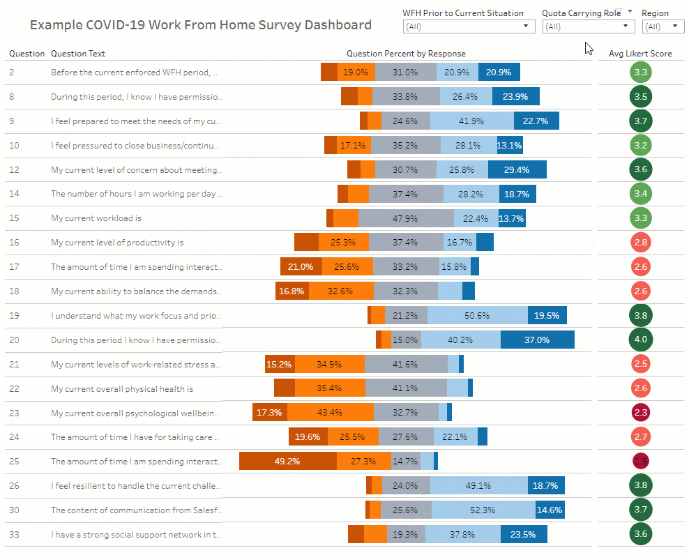
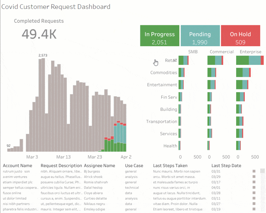
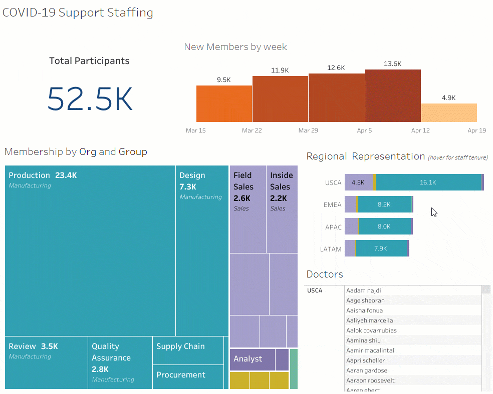
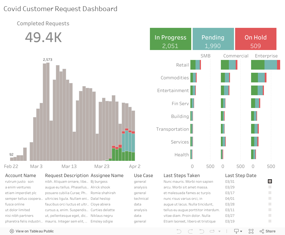
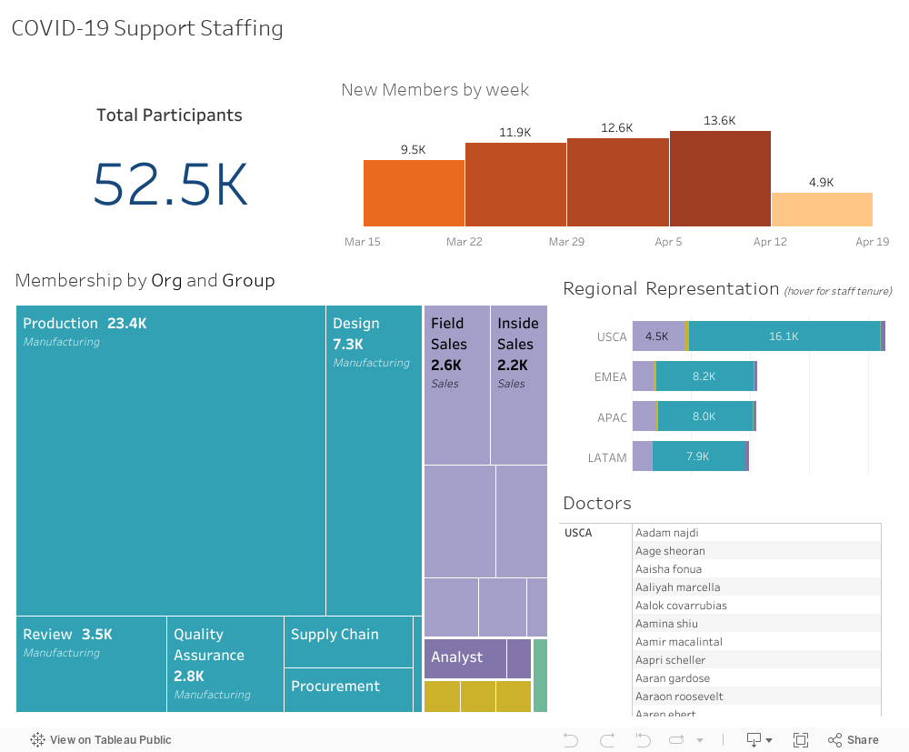
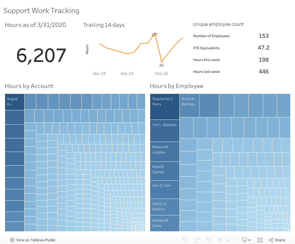
Like our customers, Tableau employees, managers and leaders find themselves in a dramatically altered business world. COVID-19 is impacting every part of our business, from where we work to the way we measure success. In these challenging times, analytics have been critical to helping us make decisions confidently and quickly. While the dashboards shared below have been simplified – and the data has been randomised and made completely anonymous – the use cases are real. Our hope is that the resources presented here enable you to do more with your data during this time and assist your plans for recovery.

Schedule a demo

Sales: reducing uncertainty in a crisis

The Tableau sales team needed to understand what deals in its pipeline were at risk because of the epidemic. Leaders asked account teams to put the name ‘COVID’ as a prefix in CRM opportunity names facing challenges, improving the tracking of potential impacts of the crisis on specific deals and segments.

Watch: See how Tableau analysed its pipeline

By creating a calculated field flagging the deals at risk, Tableau was able to isolate the potential impact of the crisis. They were then able to improve their forecast. This video shows how Tableau's sales team did it.

Interact with the pipeline dashboard

This dashboard shows the amount of pipeline at risk due to COVID-19 and allows our sales leaders to make better decisions about how to allocate their resources. Visit the Tableau sales analytics solutions page for more.

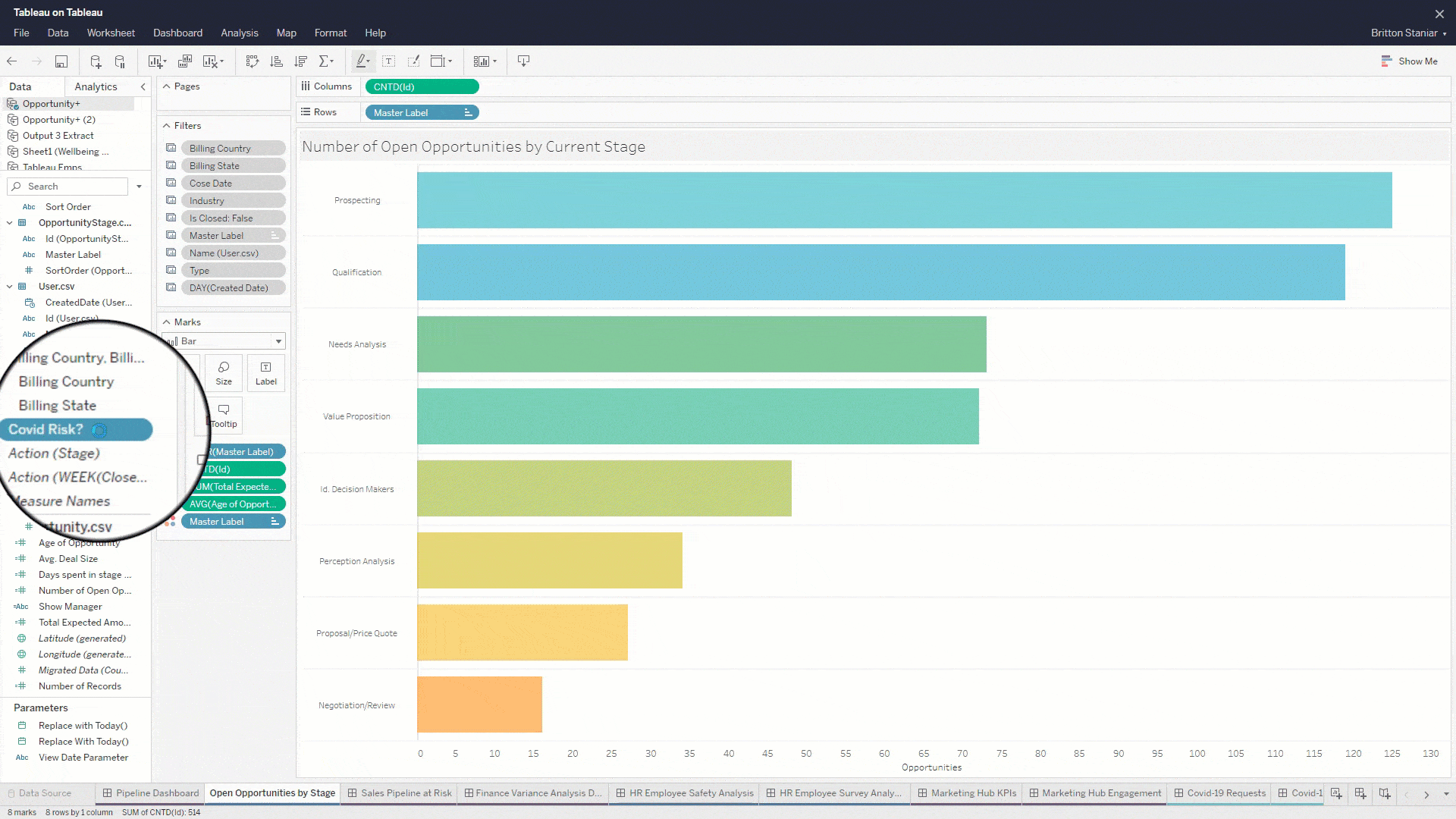
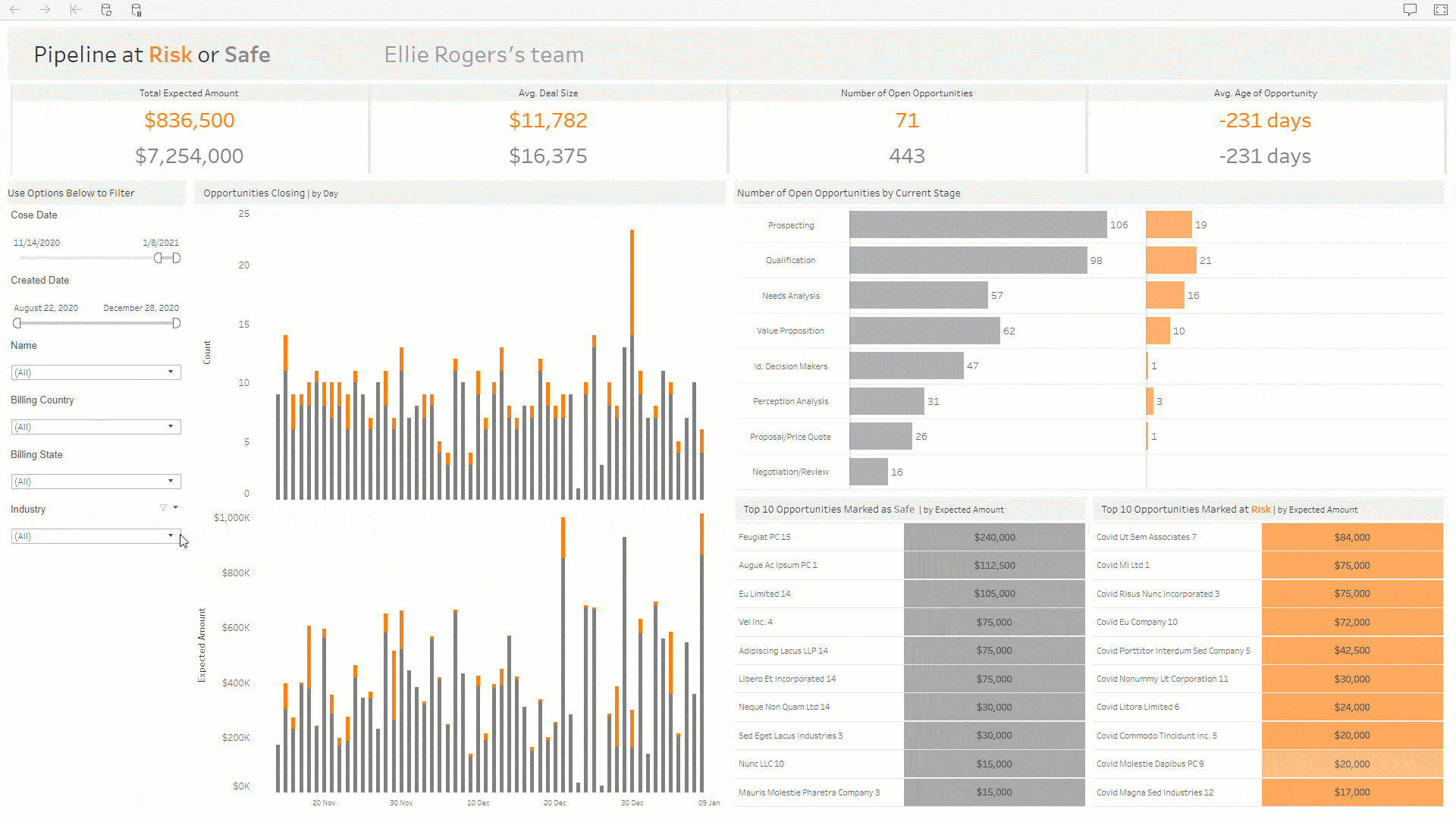
Finance: understanding and sharing variances

Given the rapid pace of changes in the economy and business operations, it can be harder than ever to manage budgets, expenses and forecasts. The finance team’s dashboards provide up-to-date results and enable the team to change forecasts as uncertainty decreases. By sharing this dashboard with leaders across the business, the finance team supports strategic decision-making and resource allocation. Learn more about using Tableau for finance analytics.

Interact with the dashboard

Human resources: ensuring employee safety and success

The COVID-19 pandemic has forced human resources departments to ask new questions about employee safety and working from home. The Tableau people analytics team used data to inform their response: They enriched their data with publicly available information and by gathering new data from an employee survey.

Employee safety dashboard

Tableau’s executives were interested in monitoring local conditions and proactively guiding employees to work from home in epidemic hotspots. We used the power of Tableau Prep Builder to join Workday data file with COVID-19 data from Johns Hopkins. This dashboard provides daily updates that will help inform executives about when it’s safe to return to work. Learn more:

Work from home survey analysis

A survey of our employees – administered in the Salesforce Survey Platform – shown in this dashboard helps us to understand the challenges of these working conditions and to learn how we can better support our employees. Filters enable analysis by employee's region, quota responsibility and previous work from home experience. Learn more:

Marketing: Understanding new digital initiatives

As the COVID-19 pandemic keeps the world stuck inside, marketing teams across the world have increasingly turned to new digital initiatives to reach their customers. Tableau has done the same by launching the COVID-19 data hub. The website hosts a collection of resources and visualisations to help people make sense of COVID-19 data. The Tableau marketing team needed to understand how the page has been gaining traction and how to improve the page with updates to the content.

Website KPI dashboard

The dashboard tracks the key performance indicators of Tableau's new web site. The KPI dashboard is posted to our internal Tableau server, where executives can subscribe via email, comment or dive into the data source themselves to answer follow-up questions. Learn more:

Website content engagement

This dashboard shows where site traffic is coming from, how visitors are engaging and what next steps users are taking. Features help you spot trends: Arrows indicate how the link has been performing relative to prior periods and prompt exploration in tool tips. With this information, users can decide what content to feature, optimise and promote when updating the page.

Customer support: Launching a new programme

As the pandemic began to spread, Tableau account reps, customer success and support staff saw a surge of customers asking for help with problems they had never anticipated. With the large volume of requests, Tableau decided to create a new process to address these COVID-specific concerns, tracking the number of requests, their statuses, the employees resolving them and more, to optimise the workflow and solutions being offered.

Learn more about how customer support teams use Tableau


Customer request management

Tableau put up an entirely new programme outside normal customer support channels. To do so, they created a intake form which enabled them to collect standardised data. They used a dashboard like this one to manage those requests. It's possible to see the oldest tickets open and contact the people assigned. Or, users can view all the tickets open in a specific segment.

Volunteer staffing assignment

When employees heard they could help customers with needs related to the pandemic, volunteers joined a slack channel to see what they could do. This dashboard shows the slack channel’s membership enriched with details about each member’s background. It's particularly useful at identifying volunteers with skill sets in regions where staffing is challenging.

COVID-19 work tracking

This dashboard shows the amount of time our teams spend working on requests by account and by employee. Hovering reveals details about the request and the nature of the work in the tool tips. Understanding how employees are spending their time helps managers on the customer success team manage their resources more effectively.

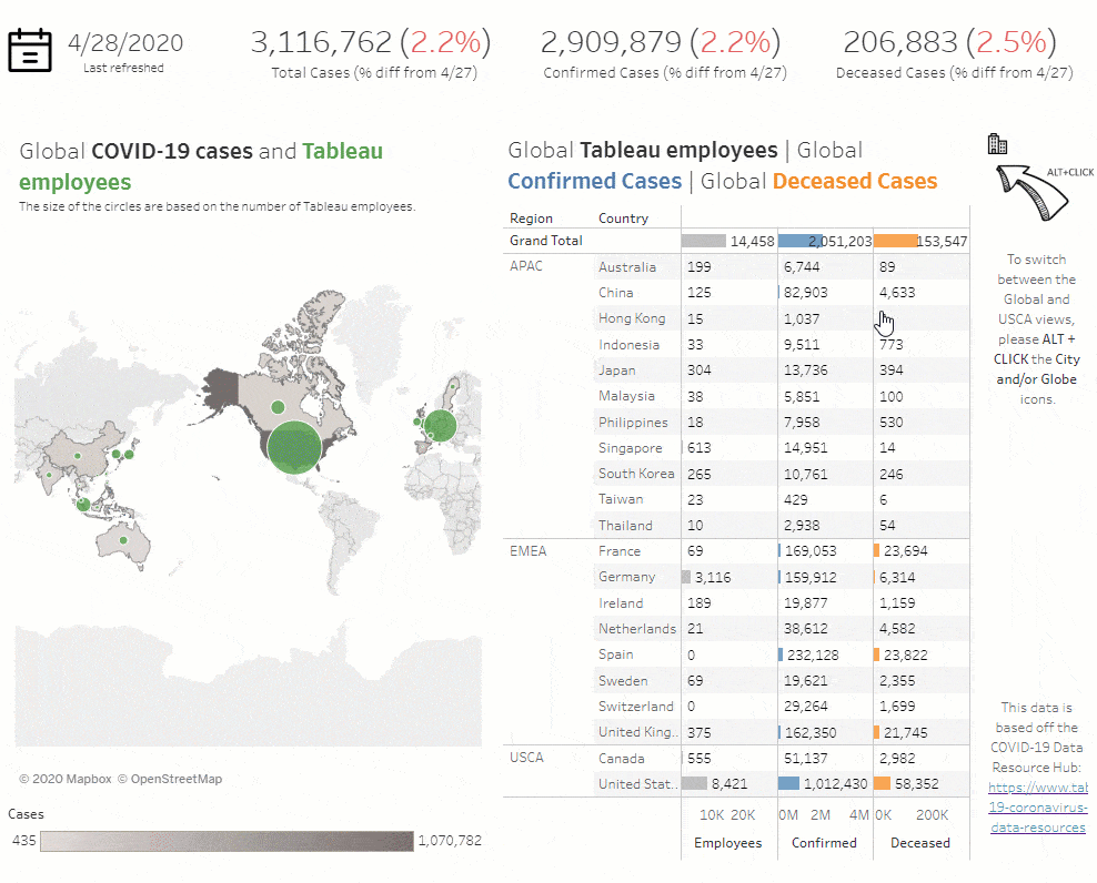
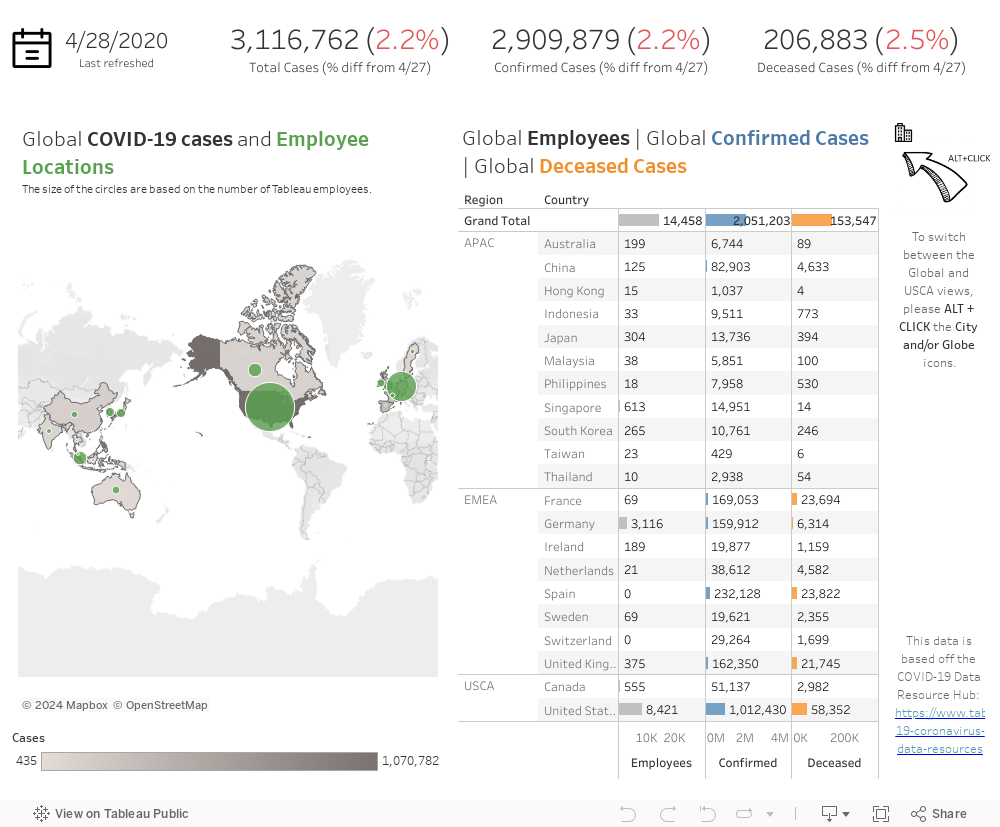
Helping the public by sharing reliable information

Preparing data and sharing dashboards

Tableau is using Tableau Prep Builder to create a clean Johns Hopkins University COVID-19 data stream that combines WHO and CDC case data. In addition to making that clean and up-to-date data available to you, we used Tableau desktop to build a global coronavirus tracking dashboard and a COVID-19 starter workbook to help you start blending your own data.

Visit the COVID-19 data hub

Learn more

Webinar: How we use these dashboards

Join Tableau technical evangelist director Ashley Howard Neville for a free webinar to learn more about the use cases described on this page. Ashley will be interviewing the people who created these dashboards and host a question-and-answer session.

Visit our registration page

To contact Tableau, please provide the following information.

Address