How to Spot Misleading Charts, a Checklist


Charts are all around us. When communicating with data, viewing a chart instead of a table of numbers can help us very quickly understand our data, make comparisons, see patterns or trends, and use that information to make better decisions. In today’s world, the ability to swiftly make decisions and act on data is crucial. When viewing and creating charts, it’s vital that we gain the ability to critically explore and discern the integrity of the information and conclusions shown in charts. Doing this important work helps us make informed decisions.
Many people don't realize that charts are as flexible and malleable as the written word. In the same way that words can deceive, so can charts. In a world of increasing misinformation, it is vital everyone has the skills to spot the tricks used by some. It's also possible to accidentally create misleading charts if one has gaps in their data literacy: these pitfalls outline ways to ensure our own charts fit to high standards.
To aid your thoughtful review of charts, we created a handy 4 part checklist with an easy to remember acronym, SCAM. SCAM stands for Source, Chart, Axes, and Message. Don’t be SCAM’d! Read on to learn how to spot misleading charts with confidence.
The S.C.A.M. Checklist, your guide to reviewing charts
Source. Know the Source.
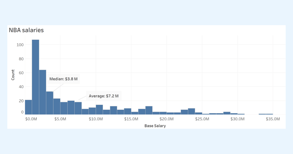 This histogram shows the distribution of base NBA salaries that shows the data grouped into ranges (or bins). The median value of $3.8 million is the better summary value for showing a ‘typical’ or middle value for NBA salaries. The average is much higher at $7.2 million.
Chart Design. Check the Design.
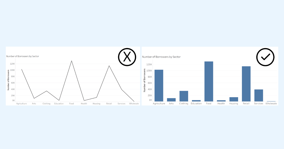 Inappropriate line chart (left) using a qualitative axis and an appropriate alternative bar chart (right).
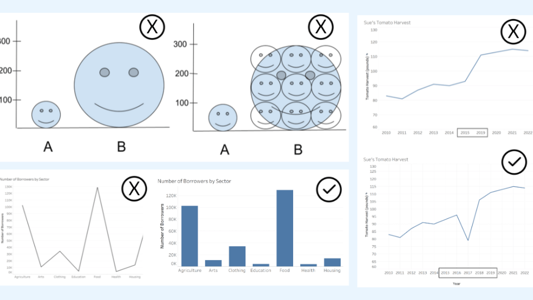
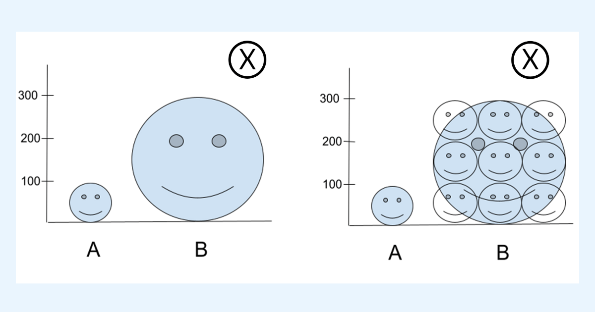 Two pictogram charts: the pictogram on the left showcases two smiley faces, a smaller “A”, and larger “B”. The pictogram on the right showcases the same “A” and “B” but also includes how many smaller “A” smiley faces would make up the larger “B”. While value B is only 3 fold more than A, the larger smiley faces lead the reader to see a 9 fold difference instead.
Axes. Check the Axes.
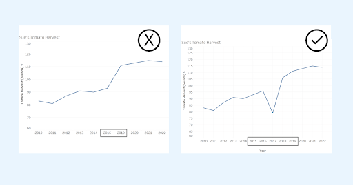
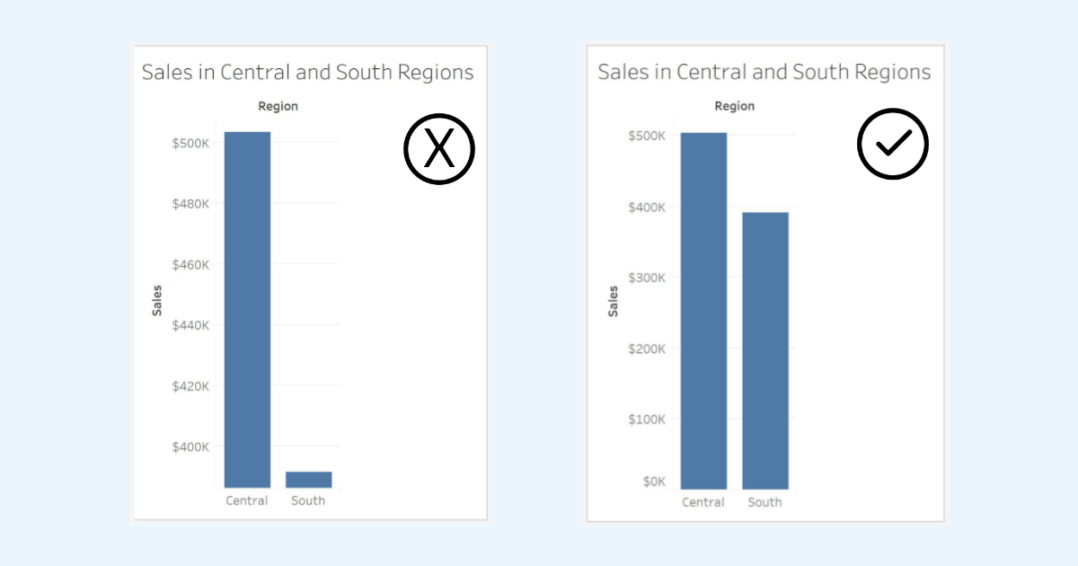 Two bar charts showing the same data, the bar chart on the right has the x-axis start at zero while the bar chart on the left starts at a value higher than zero and does not indicate the value the x-axis starts at (probably about $390K). The bar chart on the left leads us to believe that there is a very large difference in sales between the two regions. When we include the zero baseline, we can quickly see the accurate difference between the two regions.
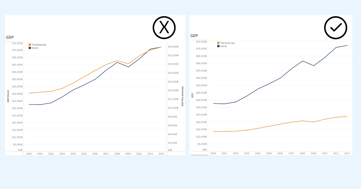 (Left) Misleading Dual Axis line graph using two y-axes with different scales. (Right) Alternative to dual axis graph showing World and The Americas GDP with same scale and a single axis.
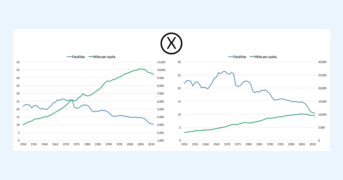 Two dual axis line charts showing the same data but using different scales. Manipulating the ranges on the second axis shows two different stories and can mislead. Images from
 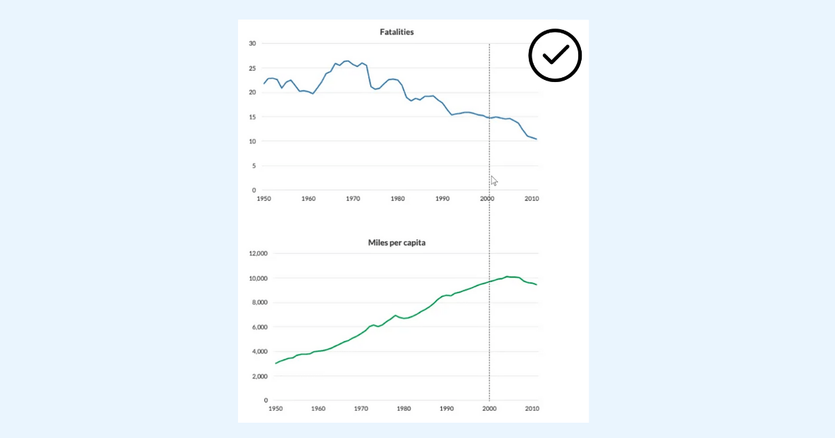 Two separate graphs vertically aligned allows the reader to make accurate comparisons between Fatalities and Miles per capita. Image from
 Message. Review the author’s interpretations and presentation of the chart.
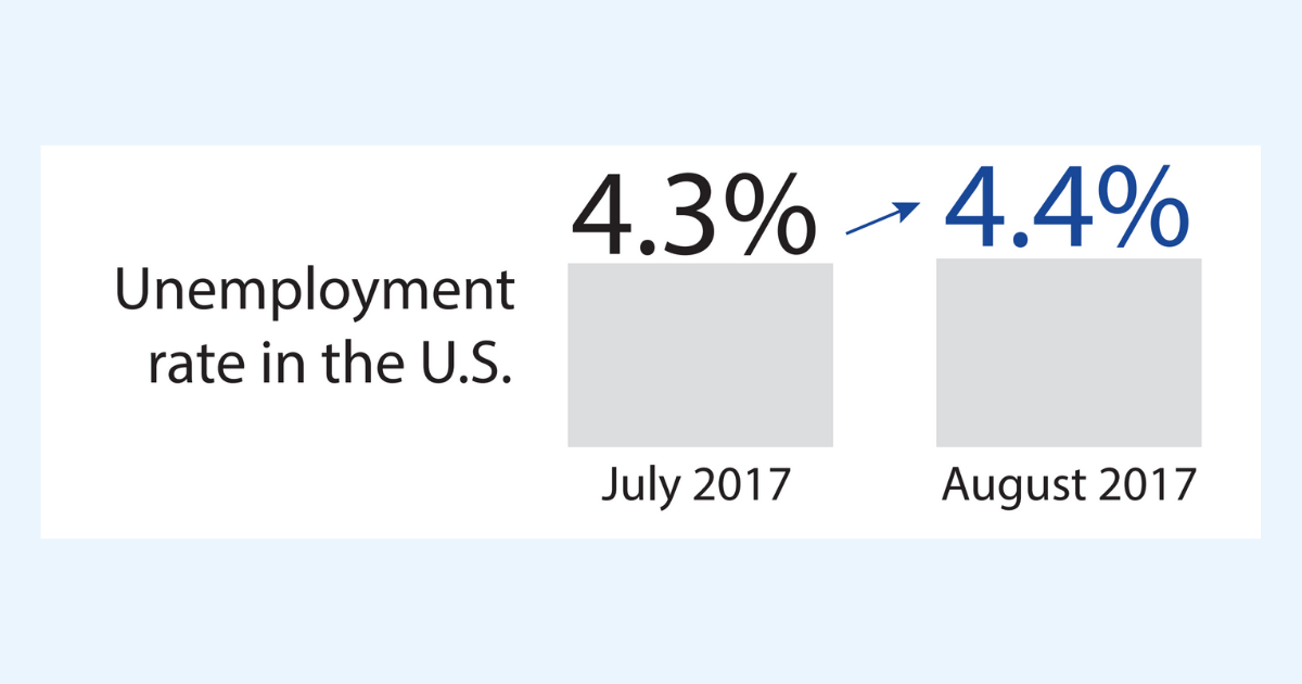 Bar graph showing unemployment increasing from July to August of 2017. Image from How Charts Lie by Alberto Cairo.
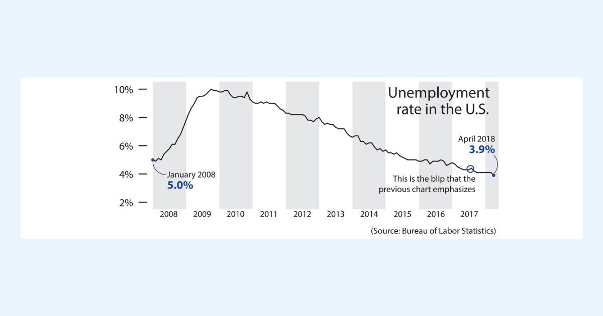 Unemployment rate shown over multiple years, showing a downward overall trend from 2009 to 2018. Image from How Charts Lie by Alberto Cairo.
Practice and be confident
Interpreting charts can be challenging work. You can all help improve how decisions are made every time you accurately read charts or call out misleading charts that you encounter. It’s important to practice. Follow the SCAM checklist every time you see a chart in your daily life.
Share and help the community
While it’s important to think critically and ask yourself smart questions, it can be extremely helpful to analyze data with others. Discuss your interpretations and chart critiques with your peers and friends. You’ll find that you can help improve the decision-making within your organization and help stop misinformation in our communities.
Want more data resources?
Data Skills Resources: Whether you’re a seasoned data veteran, or totally new to the world of data, we have the resources to fill in the gaps, or build a solid foundation to launch from.
Tableau Community Resources: Just getting started, expanding your network, or growing your skills? We’ve got personalized resources and recommendations at the ready to help you reach your goals.
Trailhead Module: Guidelines to Recognize Misleading Charts
- A five unit badge that will help you accurately read and present chart data and avoid misleading chart designs. A perfect follow-on after reading this blog!
Trailhead Trail: Build Your Data Literacy
- Seven badges that will help you explore, interpret, and communicate effectively with data. The trail covers topics such as the basics of data literacy, aggregation and granularity, well-structured data, distributions, understanding variation, and correlation and regression.
Trailhead Module: Equity and Inclusion Guidelines for Data Visualization
- A five unit badge that will help you present data through a more diverse, equitable, and inclusive lens.
Tableau Website: Grow Your Data Skills
- Learn about our pledge to bring data skills to 10 million people by 2027 and the many resources to help everyone grow their data skills.
Blog: The Problems with Dual Axis Charts
- Lisa Charlotte Muth discusses the risks of using dual axis charts and offers alternative ways to present data and lists other resources to explore deeper.
Blog: Avoiding the Dual Axis Chart
- Jon Schwabish shares why we should avoid dual axis charts and provides alternatives in presenting data.
Website: Proportional Ink
- Carl Bergstrom and Javin West at the University of Washington describe the rule of Proportional Ink derived from Edward Tufte’s classic work The Visual Display of Quantitative Information.
Website: Misleading Axes on Graphs
- Reading for a module for the course Calling Bullshit at the University of Washington. The reading describes how best to use axes on graphs.
Book: Alberto Cairo (2020): How Charts Lie: Getting Smarter About Visual Information,W.W. Norton & Company
- In-depth guide on how charts can mislead us. Helps you be a critical consumer of data visualizations.
Book: Katherine Rowell, Lindsay Betzendahyl, and Cambria Brown (2020) Visualizing Health and Healthcare Data
- With a focus on health and healthcare, a manual that will help you learn visualization best practices and create beautiful and useful visualizations for the user.
Verwante verhalen
Meet Iron Viz 2024 Finalist Chris Westlake
 22 april, 2024
DataFam Roundup: April 15–19, 2024
 19 april, 2024
Meet Iron Viz 2024 Finalist Jessica Moon
15 april, 2024
Subscribe to our blog
Ontvang de nieuwste updates van Tableau in je inbox.