Top 10 Qualifiers for Iron Viz 2024


Every year since 2011, Tableau has hosted the world’s largest data visualization competition at Tableau Conference: Iron Viz. Three contenders take center stage and have 20 minutes to tell the most compelling story using the same data set. There is a qualifier round that leads up to the championship, which are judged using the same criteria. (More on that below.) This event is unlike any other, celebrating data skills, data storytelling, and the power of the Tableau Community.
The 2024 Iron Viz Qualifier competition results are in, revealing this year’s finalists! This year’s theme is love. From health and well-being, musical groups, hobbies, friends, and family—the DataFam were challenged to viz what makes their hearts full. The theme ignited a spark for many, inspiring 196 entrants—117 submitting visualizations for the first time–with three of the top 10 being first-time submissions.
Among the hundreds of entries, 10 visualizations pulled at the judges’ heartstrings to make it to the finals. But three of these visualizations burned hot enough to advance to the Iron Viz Championship at Tableau Conference 2024 in San Diego.
How are the Iron Viz Qualifiers judged?
The judging panel—which is made up of Tableau Ambassadors, Visionaries, and former Iron Viz finalists—reviews all submissions, doing the difficult task of selecting the finalists, using the following criteria to score all entries:
- Design: How appropriate is the design for the story being told?
- Storytelling: Is a clear story being told or a question being explored, and is there appropriate context?
- Analysis: How sophisticated and appropriate is the data that is being used for the story?
Thank you to our community judges for dedicating their time and expertise: Alice McKnight, Allison Wright, Annie Nelson, Brittany Rosenau, Candice Munroe, Chris Williams, Christina Gorga, Dan Chissick, Deborah Simmonds, Doc Kevin Lee Elder, Eric Balash, Fraser Gallop, Fred Najjar, Jack Hineman, James Emery, Jim Dehner, Kyle Yetter, Laura Peterson, Lisa Trescott, Louis Yu, Marcelo Has, Mike Komer, Mo Wootten, Pablo Gomez, Rajavel Selvaraj Ganesan, Ravi Mistry, Rohit Prasad, Roshni Gohil, Tore Levinsen, Viviane Lefebvre, Whitney Wood, Will Sutton, Zach Bowders.
Who did the judges determine created the top 10 vizzes?
It’s no secret that the Iron Viz Qualifier is a demanding challenge that tests entrants’ skills in every way through data sourcing and preparation, trying new features and techniques, data storytelling, and applying beautiful designs. Each submission is an achievement and we commend all applicants for their hard work in creating these visualizations. Explore the 2024 Iron Viz Entries.
2024 Iron Viz finalists
These three visualizations burned hot enough to advance to the Iron Viz Championship at Tableau Conference in 2024.
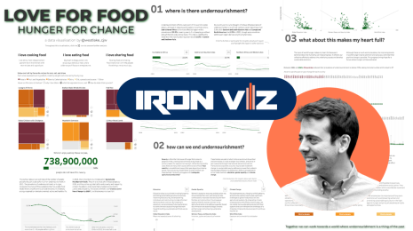
Love For Food: Hunger For Change
Chris Westlake - Edinburgh, UK
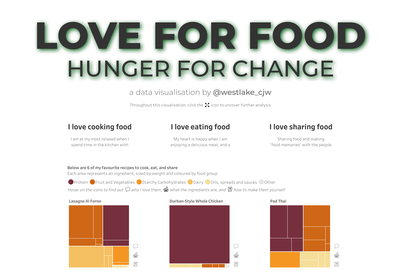

Chris Westlake: This was my fifth time entering Iron Viz, and definitely the topic that I enjoyed the most. I have always had a passion for three things - food, helping people less fortunate than me, and data. This year's qualifier theme allowed me to combine all three of these things. I love food, but I hate that not everyone in the world has the option to. By shining a light on the important issue of global hunger, I believe we can make it a thing of the past.
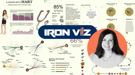
Hart of Dixie
Jessica Moon - Huntsville, Alabama, USA
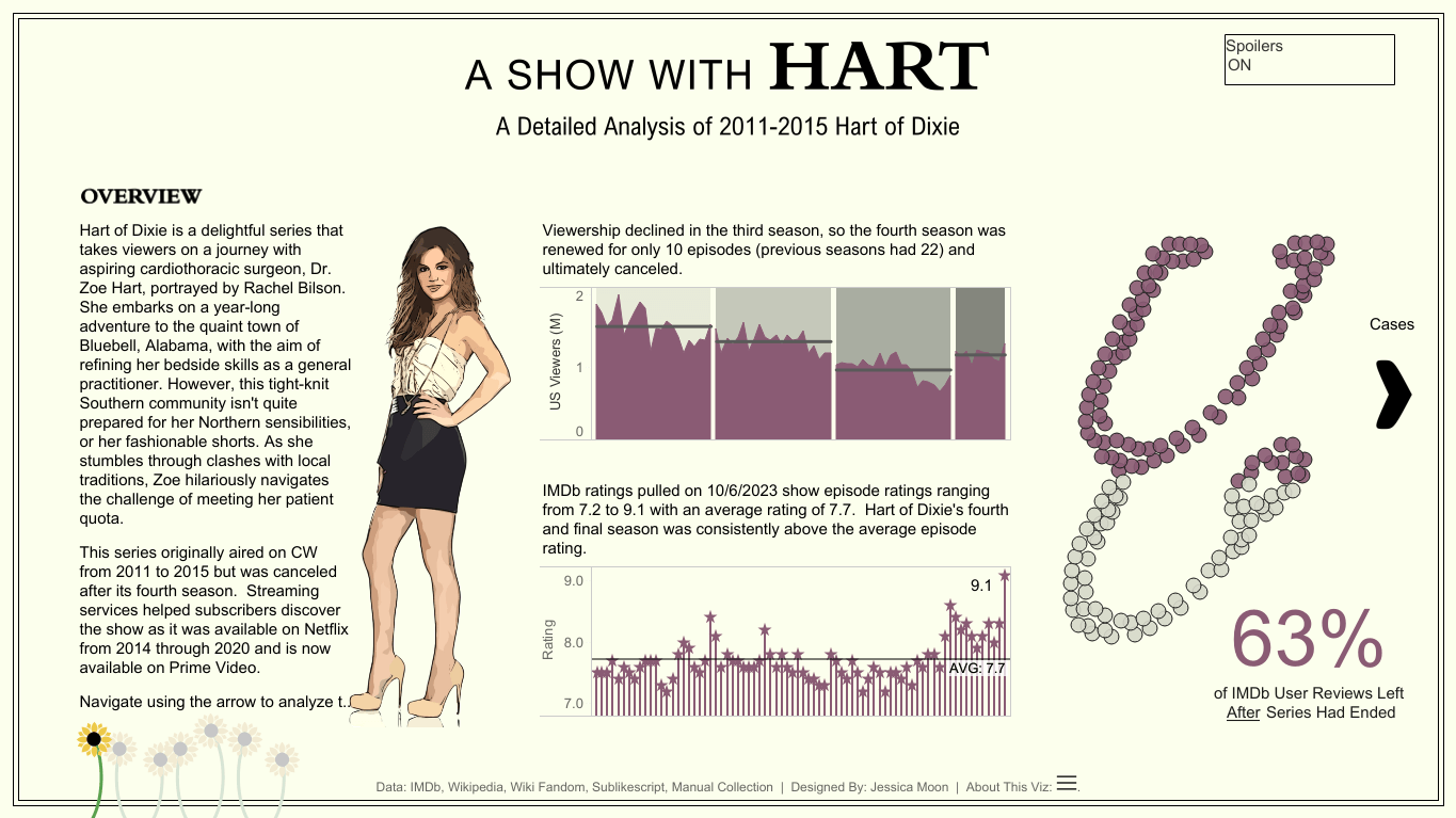

Jessica Moon: I have been working with Tableau for nine years, with a more intensive focus for the past five. I was introduced to Tableau in 2014 when I transitioned to a testing role on a Data Science team involved in creating Tableau visualizations. As I became comfortable with testing and identifying potential issues in data visualization creation, my interest in mastering the software deepened. At my manager's suggestion, I enrolled in a Udemy course by Kirill Eremenko,“Tableau: A-Z,” gaining valuable insights, followed by an advanced “A-Z” course (also by Kirill). During this time, I developed an internal usage dashboard at work and my first-ever Tableau Public dashboard during my personal time, focused on Colton’s season of The Bachelor. Achieving the Tableau Certified Associate certification, along with learning SQL, provided the confidence and credibility needed to transition from testing to development.
What is (not) love?
Pata Gogova - Prague, Czech Republic
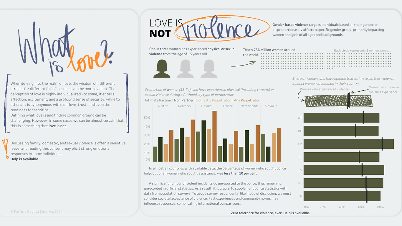

Pata Gogova: My Tableau journey kicked off in March 2020 when I started playing around with it. Funny how things go—my former boss wanted a modern tool for slick reports and complex calculations, and voila, I got the chance to dive into Tableau. Fast forward a bit, and I ended up in Prague landing a Tableau developer job. That's where things got even cooler—I learned the art of not just making charts work for business but making them look pretty too! As a bit of a challenge to myself, I started sharing my Tableau creations on Tableau Public and plugged into communities. That move actually led me to co-lead Prague's Tableau User Group. Currently, I'm genuinely excited about extending Tableau's reach, particularly by supporting those keen to explore it. Engaging with communities and sharing insights? That's what truly enhances my Tableau journey right now!
Iron Viz runners up
An ode to Chilean wine
Diego Parker - London, UK
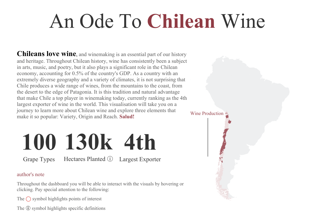

Diego Parker: I decided to participate this year because I currently lead the adoption of Tableau at Lloyds Banking Group in the UK and wanted to inspire others to submit their entries. Regarding the topic, it is something very close to my heart as I am originally from Chile and I wanted to highlight something that I would say most Chileans enjoy and feel very proud of, our wine.
This is my second time participating in Iron Viz, the first being in 2020 when I reached 4th place with my viz about covid in Latin America. Similarly to the first one, I intended to add a translation to Spanish but I didn't have the time to do it. Hopefully now that the judging has finished I will be able to implement it.
There’s no business like show business
Lisa Rapp - Frankfurt, Germany
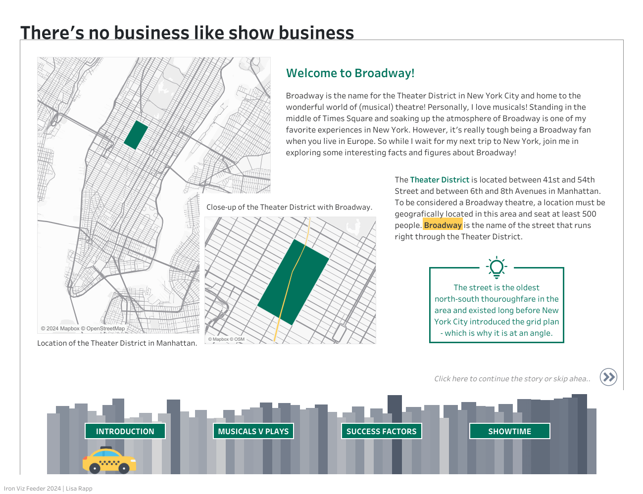

Lisa Rapp: This is the 4th time I have entered the competition and the third Broadway themed entry—so this has almost become a tradition for me. I'm a big Broadway fan but it's really hard when you're living in Germany. So I guess creating vizzes about some of my favorite musicals.
A Madman with a Box: My Journey with the Doctor
Nicole Klassen - Atlanta, Georgia, USA
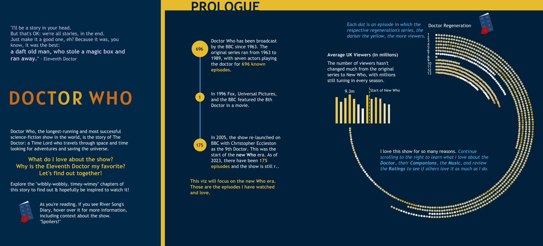

Nicole Klassen: The DataFam were my biggest cheerleaders! The community helped me immensely, from encouraging participation to feedback on my viz throughout the process. My fabulous ladies, Elisa Davis, Jessica Moon, Nicole Mark, and Emily De Padua, all supported each other from the start, bouncing off ideas, coming up with schedules for each other to ensure we all finished, and providing feedback on anything I asked. Michelle Frayman is always there to support the community with encouragement and feedback, and Sarah Bartlett organizes excellent feedback sessions that support the community. The wonderful thing about IronViz is the whole community pulls together to support each other, so there were many other people offering words of encouragement and support as well; too many to list, but it was wonderful.
The Key To My Heart
Stephen Detzel - Cincinnati, Ohio, USA
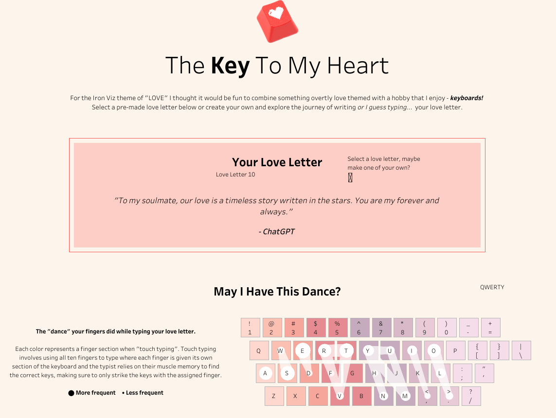

Stephen Detzel: This was my first time entering Iron Viz. I was really struggling for ideas and was even debating whether to enter the competition, but the idea just came to me while lying on the couch a few nights before the deadline. I have come across a ton of cool analyses from the keyboard community over the years (a few examples being https://www.patrick-wied.at/projects/heatmap-keyboard/, https://mkweb.bcgsc.ca/carpalx/, https://bit.ly/keyboard-layouts-doc). I had recently seen some awesome vizzes on Tableau Public that utilized the path capabilities, and I thought it would be cool to see if I could use it for a keyboard/typing viz. Once I had a working prototype, I realized that it was too cool not to enter so I scrambled to put a dashboard together before the deadline. There are so many different keyboard layouts so I just kept to the four most well-known, maybe in the future I can add some of the more obscure ones.
Love Across the Eras
Emily De Padua - Bloomfield, New Jersey, USA
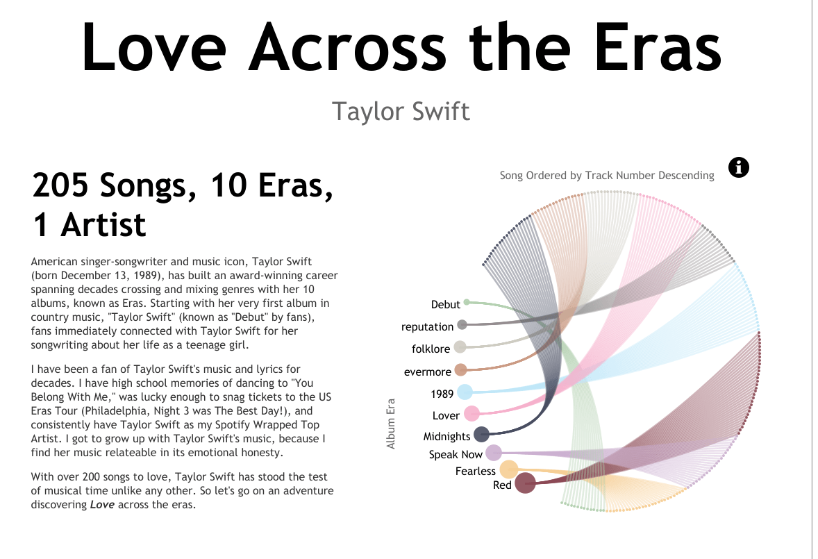

Emily De Padua: I’m not going to lie, when I first heard the theme, I immediately scoffed at my friends because I immediately thought of romantic love, and I didn’t want to viz about my romantic love life. After that initial reaction, I took a step back and I thought about what brought me joy this year, and truthfully, it was my love for Taylor Swift’s music. I went to see her in Philadelphia for her Eras Tour. I was up all hours of the night talking about her music with friends. Taylor Swift was the soundtrack to so many cherished memories in my life. The month of the Iron Viz Qualifier window, I was counting down the days to 1989 (Taylor’s Version). I had always wanted to do a viz on Taylor Swift’s music, but just never found the right timing or idea, until now.
This was my third time entering Iron Viz, and I’m really proud that all three times I’ve had the honor of making it to the Top 10. I love the Iron Viz format and the camaraderie that comes with entering. It’s a pressure cooker environment where I’ve flourished and made some of my very best work.
Enough Bookshelves: My Family’s Love of Books
Michelle Frayman - Auburndale, Massachusetts, USA
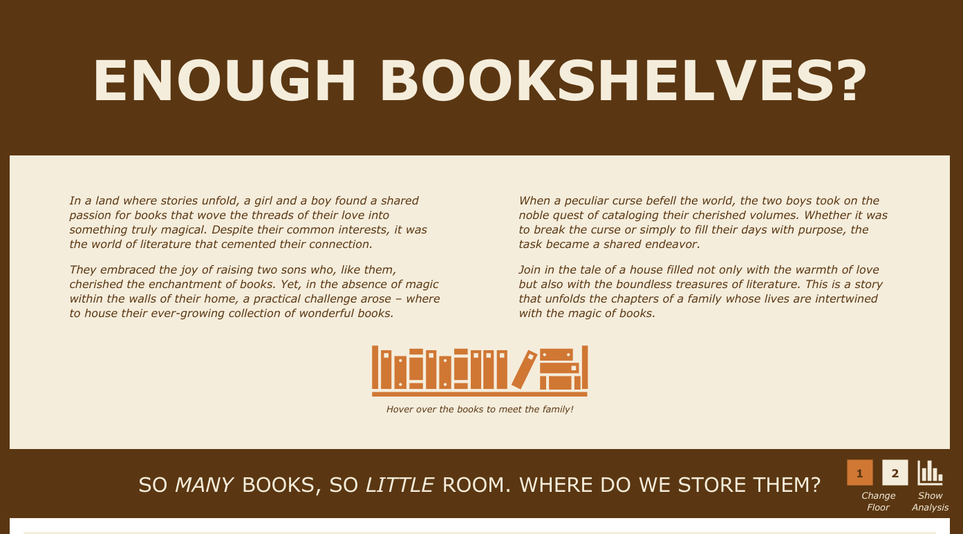

Michelle Frayman: I could never have gotten to the top 10 or even entered Iron Viz had it not been for the DataFam. I am grateful to everyone who participates, cheers others on, shares their skills and offers help. Sarah Bartlett led 2 community initiatives that were critical – IronQuest and Iron Viz Feedback. The first allowed me to practice in a safe space to get the confidence that I could do this and the second allowed me to get needed feedback while I was developing my dashboard AND provide feedback to others. I also leaned in heavily on my VizOfficeHours partner Nicole Klassen and was delighted to get feedback from our weekly participants as well.
Paris Bike Lovers
Marion Joubert - Plateau-des-Petites-Roches, France
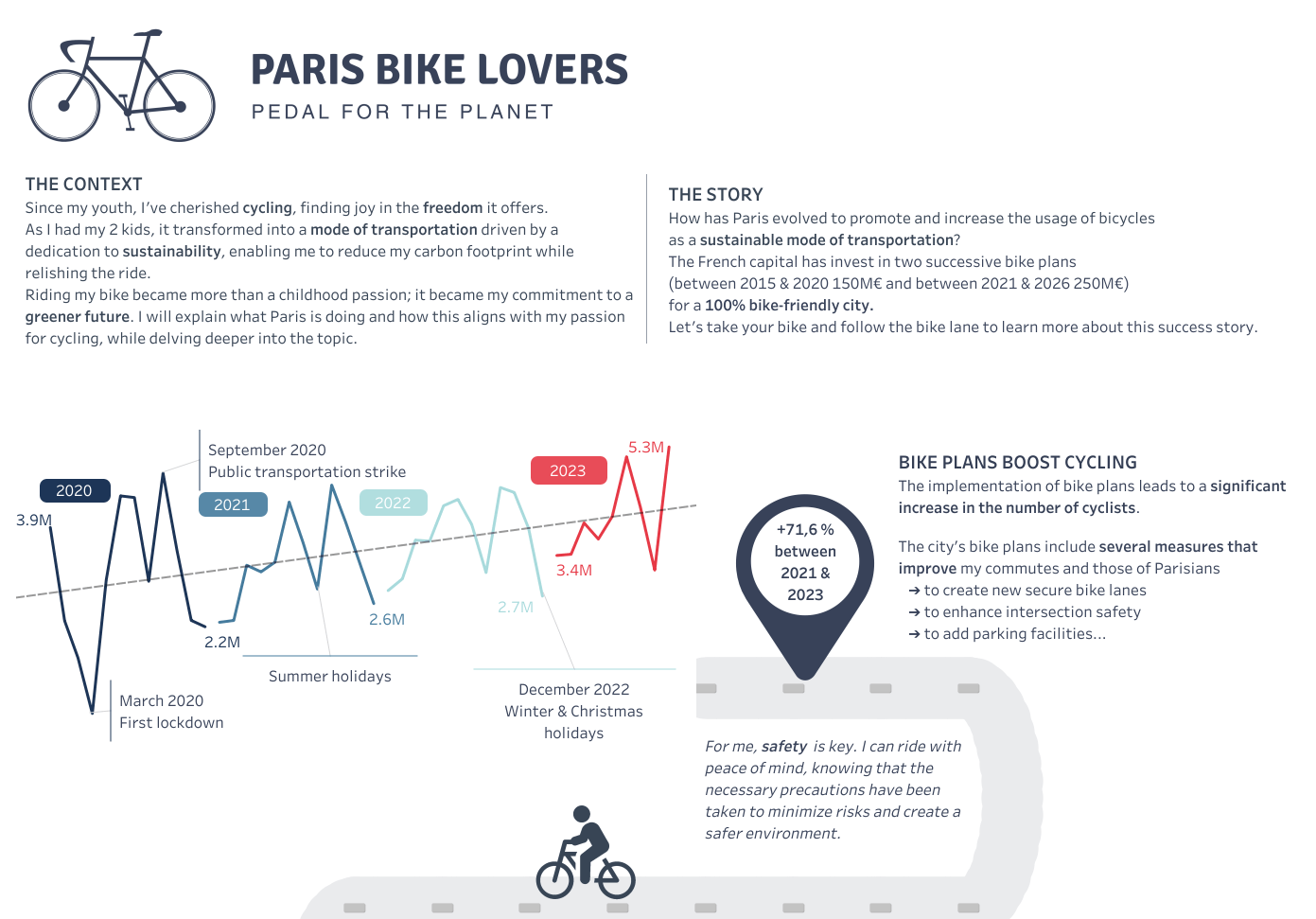

Marion Joubert: While it may not be the latest functionality, I have a deep appreciation for the dynamic zone visibility feature in Tableau. It greatly aids in maintaining simplicity within dashboards. Although the image role feature would have been incredibly useful, unfortunately, the image URL data sources were not consistently clean.
Countdown to the 2024 Iron Viz Championship at Tableau Conference
Congratulations to all of the lovely finalists and thank you to everyone who participated. Who will claim victory, bragging rights, and thousands of dollars in prize money for themselves and a charity of their choice? You’ll want a front-row seat to catch all of the action live.
The countdown is on to the Iron Viz Championship at Tableau Conference, April 29–May 1, 2024 in San Diego. Sign up to be the first to know about registration to attend Tableau Conference in person, or watch on Salesforce+.
Want to experience the excitement of the top 10 finalists announcement with championship co-hosts, Senior Data Evangelist Andy Cotgreave and Tableau EMEA Solution Engineering Archana Ganeshalingam, and three community qualifier judges: Tableau User Group Ambassador Chris Williams, Tableau Forums Ambassador Rajavel Selvaraj Ganesan (Vels), and Iron Viz 2021 Champion Lisa Trescott? Watch the announcement event.
Relaterade berättelser
Meet Iron Viz 2024 Finalist Chris Westlake
 22 April, 2024
DataFam Roundup: April 15–19, 2024
 19 April, 2024
Meet Iron Viz 2024 Finalist Jessica Moon
15 April, 2024
Subscribe to our blog
Få de senaste Tableau-uppdateringarna i din inbox.