Visually analyzing German basketball league success with Tableau Public
Tableau as a company provides good support, and the community is also very helpful. So when you do get stuck, answers aren’t hard to come by and you won’t have to wait too long, either.
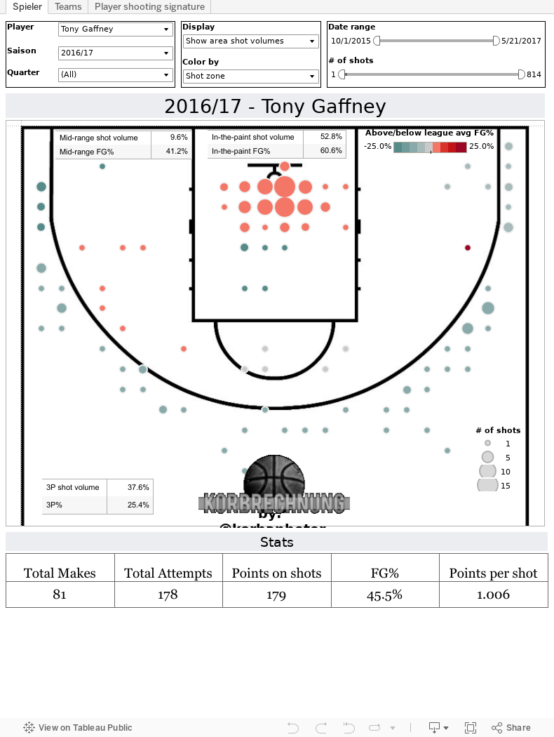
Blogger and data journalist Ingo Levin from Berlin spends his free time analyzing and visualizing every single shot made in the German Basketball league BBL. His shot charts are embedded into his articles published across various blogs and internet platforms for the basketball community.His interactive and easy-to-use dashboards allow for detailed comparison of players, teams, shot positions, shot percentages and lots more. His weapon of choice is Tableau Public, a data visualization and publishing tool available free of cost for non-commercial users. Levin has come to appreciate Tableau Public especially for its excellent user support provided by support staff and the Tableau community alike.
Tableau: Please introduce yourself briefly. Ingo Levin, Data Journalist and Blogger: Hi, I’m Ingo Levin. I’m a blogger, or what Tableau people call a data journalist. I work a lot with basketball data. I am a passionate basketball fan and have set myself the task of visualizing lots of data related to the sport with the orange ball. I write for a variety of blogs, but my own blog is korbrechnung.de. This is a mix of hoops and calculations, and calculation matters can be visualized. We also have another small project, giveandgobasketball.de, where we make a video show and podcasts about the sport in general. I regularly contribute to courtreview.de, the biggest German language basketball community, where I also embed Tableau statistics or Tableau visualizations on a regular basis. Tableau is my tool of choice.. Tableau: What exactly are you doing with Tableau solutions? Ingo: This currently involves, since the beginning of this German Basketball League season, the recording of all players' shots during a game. This includes recording what position they were thrown from and whether they went in, which player made the shot and at what time. I prepare the data, aggregate it and create entire charts for players and teams so that all of their shots can be seen over the course of the season. It is possible to see that one player shoots particularly well from the left corner, for instance. Player A gets to the basket very frequently. He makes 60 percent of his shots close to the basket but scores only 20 percent of the time. I provide these analyses in my blog so that people can really say precisely for every player and every team what their preferences are and where they may not play so well. To do this, I use Tableau Public. It’s great for me because it gives me a great number of options with which to visualize things. Also, what is good here is that for someone like me—or for a journalist—it’s publicly available without me having to pay thousands of Euros in licensing fees. Tableau: What sort of feedback do you receive with regards to your Tableau visualizations? Ingo: The feedback from the community is consistently positive. It must be said that analyzing and leveraging data in basketball in Germany is still not very common. People now have a tool that lets them explore the background in a way they might not have known before, so the feedback is extremely positive. Tableau: Are the actual teams making use of your Tableau-analyses? Ingo: I know from some people and team officials that they have actually used them. I couldn’t say whether they are used during daily training or in game preparation. However, I know that they know about it. I know that people are very open and positive about this and that it could certainly give you a slight advantage over other teams in preparation. Naturally I hope that they will be used even more in the future. Tableau: Which visualization features of Tableau are the most important or useful to you? Ingo: For me, the best things I’ve made with it are these shot charts. These are scatter plots where I’ve projected the basketball pitch as the background image. Tableau: How would you describe your experience with using tableau? Easy or difficult? Ingo: The learning process never ends. This is also because there is a very big community. There are also websites for Tableau Public where all the visualizations and work folders of other users can be viewed publicly. This always provides new inspirations. Tableau: Which aspects of the Tableau environment are especially important to you? Ingo: For me, one of the key aspects in the entire Tableau portfolio is the fact that Tableau Public is freely available for private individuals. This isn’t just about saving costs. It also offers a very simple entry point into the entire world of data visualization. There are so many people writing interesting articles, but in the end it’s only text. This text would be so much more valuable if it was backed up with an informative chart. I sometimes get the impression that a lot of people would like to do this but simply don’t have the tools available. Moreover, a lot of people can’t program, create JavaScript files, charts, etc. So, it’s ideal that such a product exists. It fills a real market gap so that normal people with a certain level of data and technology knowledge can use it to provide a more interesting context. For me, that's really a super thing about Tableau. The company really focuses on data journalists as its target group. It wants to support them and offers them invitations and is always available when questions arise. Tableau: What are your plans for using Tableau in the future? Ingo: I certainly have some future plans for Tableau. So far, I’m really just scratching the surface. As someone who is often dealing with business-intelligence technology in a professional context, I certainly have a lot of experience. I recognize where there is still potential, including for the things I’m currently doing privately with basketball shot-statistics analysis. I also have various new visualizations in the pipeline. I’m currently testing how I can best implement them using Tableau. So far, I can say that everything I want to do can be done with Tableau. For the start of the next season, I will certainly be able to provide new charts and new visualizations for the community. Hopefully they’ll be received as well as the last ones were.